
Boppy works to empower, support and educate mothers throughout their journey of motherhood with pregnancy, nursing, and baby care products.
Scroll down to view more.
Frontend Development, Shopify, UI Design
August - October 2022

Boppy was currently on an old Shopify platform that did not reflect their brand, was not user friendly, and did not have the structure they needed to grow their business.
The main objective for Boppy was to design and develop an impactful representation of their brand through Shopify. From a frontend perspective, the components we needed to focus on were:
We broke the research process into multiple components to throughly investigate areas of improvement for the site.
After I completed the workplan for the frontend components, I developed the custom platform theme by completing the base styles, home page, and healthcare pages.
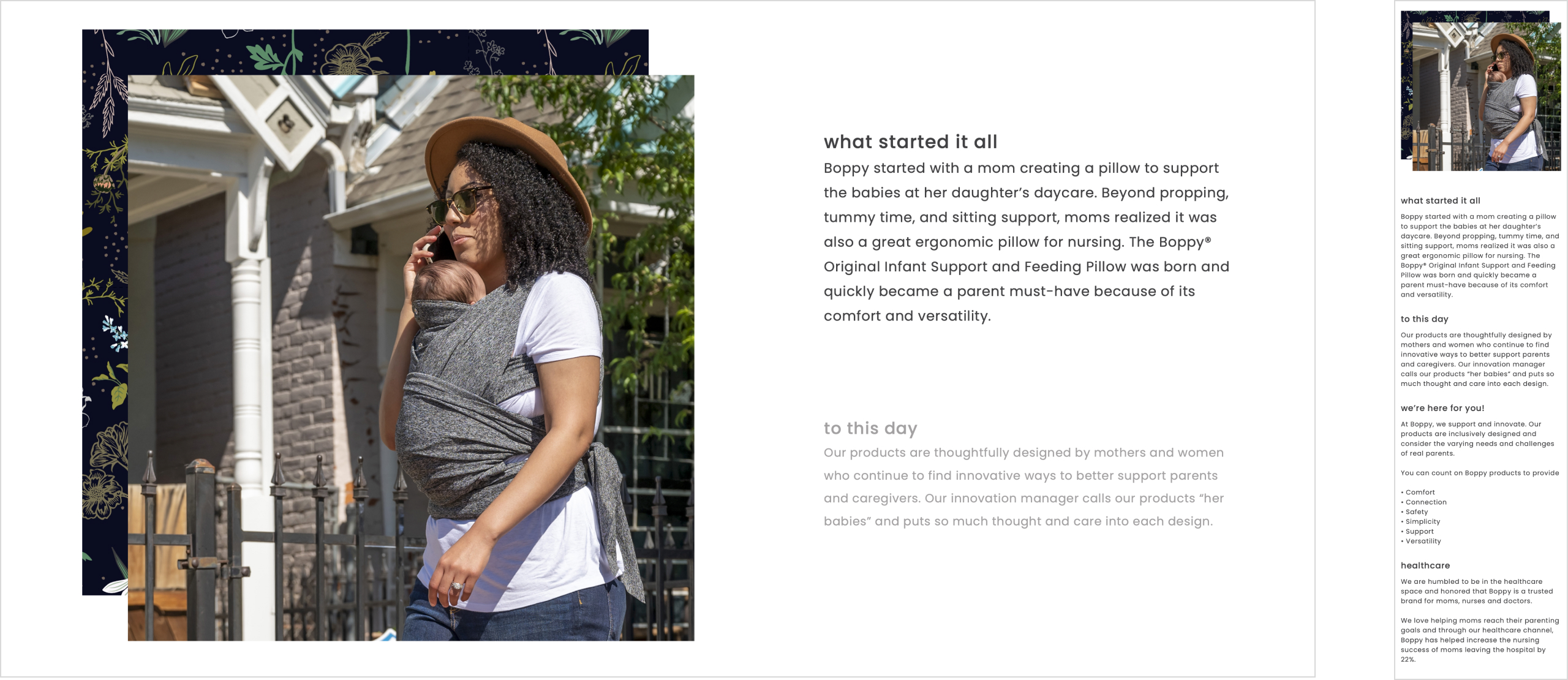
The home page was designed and developed with an emphasis on Boppy's values and identity. The home page heavily showcases their products and missions statements to do so.
Move mouse into the box below to scroll through the design

Home Page
We adjusted the site to be compatible with mobile and tablet devices across all browsers.
We opted for a vertical and stacked layout for both mobile and tablet for easy scanning.
We set hover and focused states to have the same styling to maintain mobile compatibilty.
Move mouse into the box to scroll through the design
With Boppy aiming to grow their business with a focus in both B2C and B2B, we were tasked with creating custom pages to showcase their healthcare products and their values.
Move mouse into the box below to scroll through the healthcare landing page
Move mouse into the box below to scroll through the order healthcare products page
The mobile and tablet versions of these two pages reflect the same changes we implemented for the home page.
Move mouse into each of the boxes below to scroll through the designs

Healthcare Landing Page

Order Healthcare Products Page
I developed a new slide layout for the slider content block. This “Pocket” layout displays images to the left of the slide, with text content overlapping it slightly on the right. I developed the settings for this block to enable adding two images to a slide in the theme settings.
On mobile and tablet, I changed this slide layout to have a stacked layout. This was done to make use of the space and dimensions available for mobile and table screens. This also makes for easy scanning of the content on a screen with more vertical space.

Customized slider block (from left to right: desktop view, mobile view)
I developed this block by building image animations that are triggered by scrolling. I built the settings for this block in the theme settings to allow for customizations on the animated images. Users can upload their choice of ten images.
I also adjusted the animation and layout on mobile and desktop to account for the vertical spacing.

Customized parallax scroll block (from left to right: desktop view, mobile view)
I developed this block by building text transform animations that are triggered by scrolling. I built the settings for this block in the theme settings to allow for customizations on the text content. Users add whatever text they desire and have the option to add a subheading, heading, paragraph text, and a button.
I also adjusted this block for mobile and tablet views by removing the animation completely. This was done to account for the vertical spacing.
Customized parallax text block (from left to right: desktop view, mobile view)
This was my first Shopify project from the very beginning to the end. I gained a lot of development problem solving skills by challenging myself to build more complex features such as the custom CMS blocks with animations and custom theme settings. It was a rewarding experience overall.