
Sonneman is a modern lighting atelier at the intersection of architectural and design innovation.
Scroll down to view more.
Frontend Development, Magento, UX Research
Feb - March 2022
Sonneman sought to improve their user experience on the e-commerce platform we previously built for them. They received an UX audit from an external agency and discussed how to implement these recommded features with our agency.
The frontend components to be developed were broken up into three parts:
We broke the research process into multiple components to throughly investigate areas of improvement for the site.
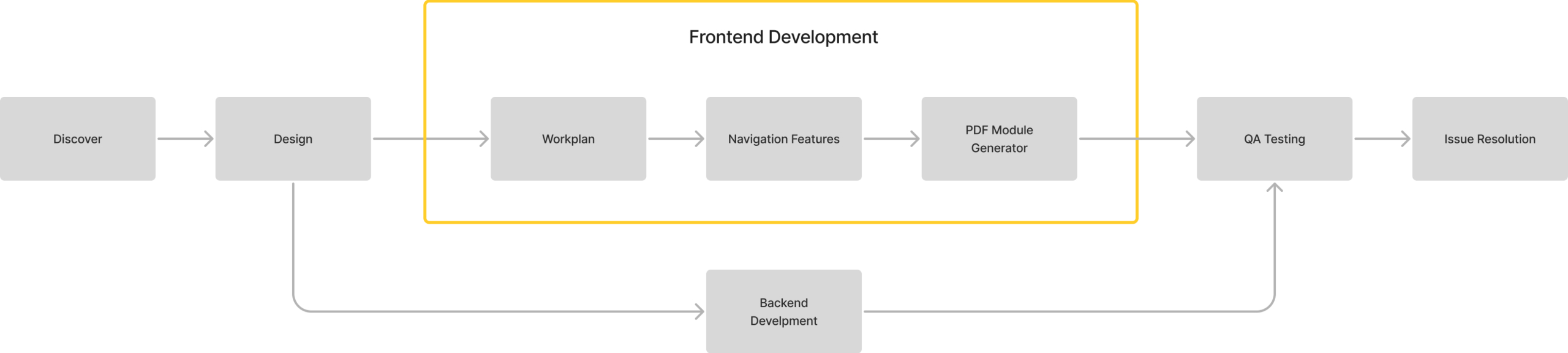
I worked with a backend developer to complete this sprint project. I built the frontend features by modifying Magento with PHTML, XML, PHP, SASS, and JavaScript.
We developed a horizonal navigation to improve findability. With a horizontal layout, users will see all the filters at once, without having to scroll through a vertical list. With this layout, they won’t miss any filters options they are looking to choose.
Moving the “Sort” option to the very beginning of this layout also increases its findability. Previously, it was placed at the top of the product grid, separate from the filters and users would easily miss this function.
Now, all relevant options are grouped together in a horizontal navigation to improve findatility and therefore, the user experience.
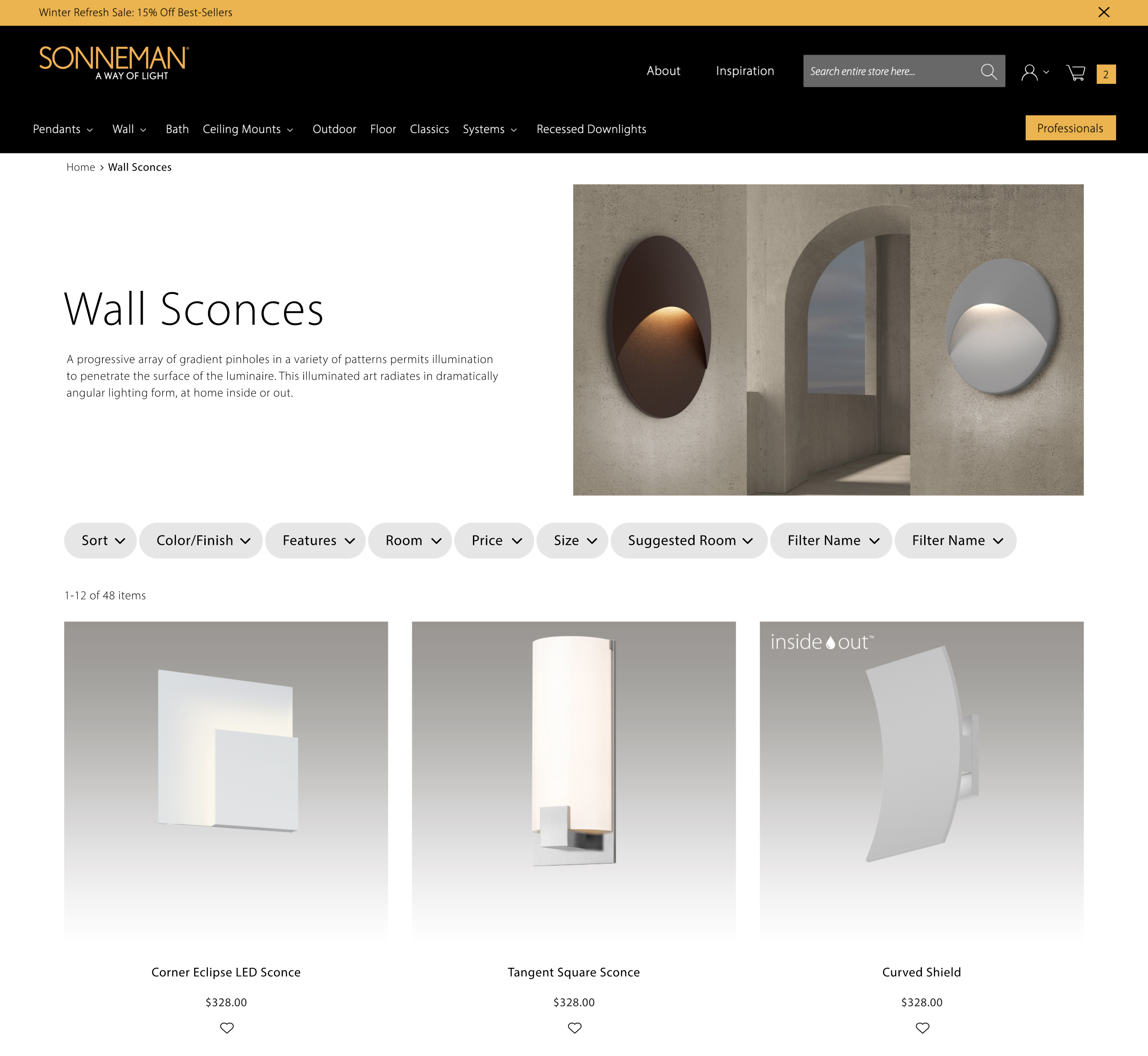
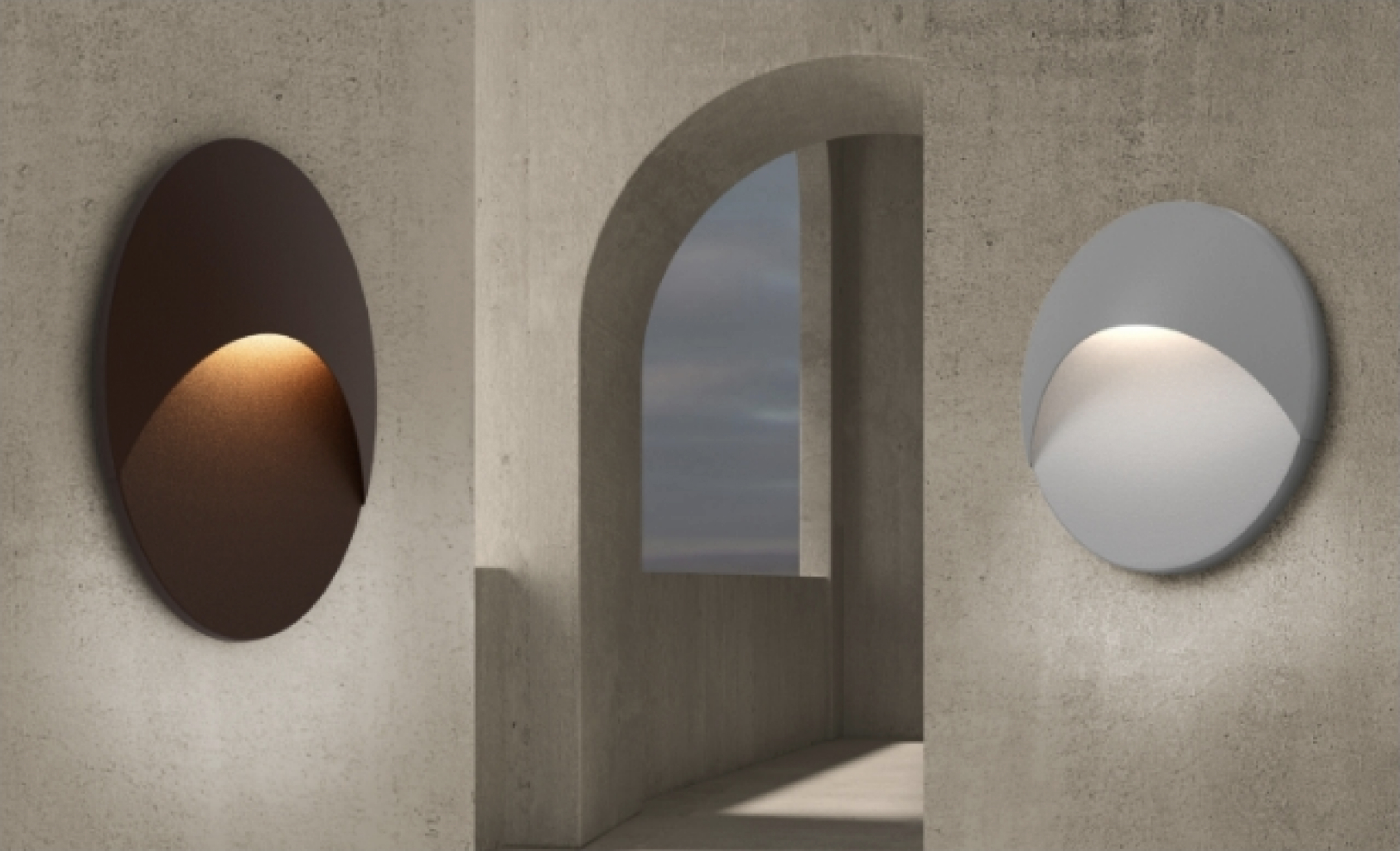
Horizontal navigation on the Product Listing Page
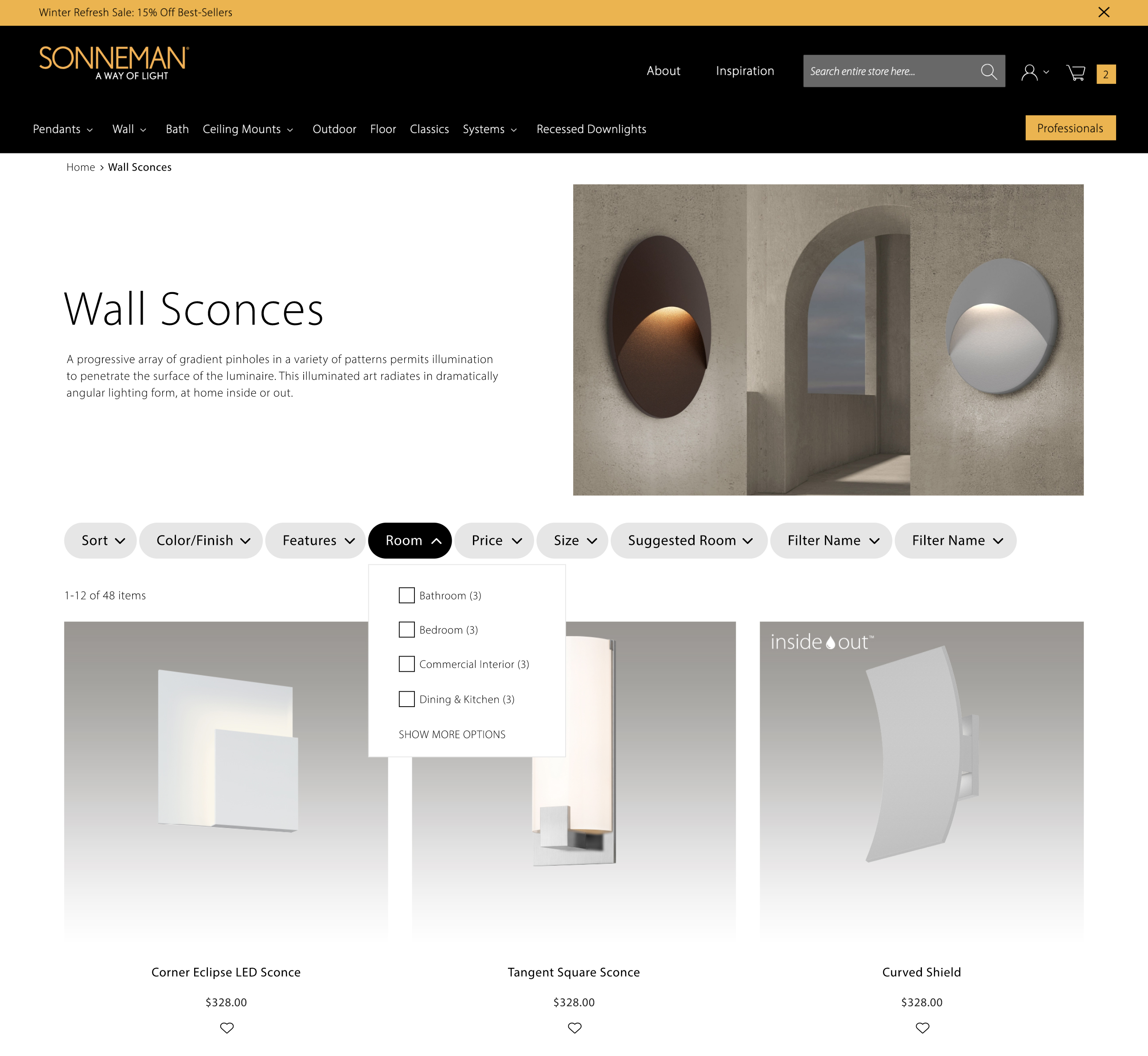
An opened filter on the horizontal navigation
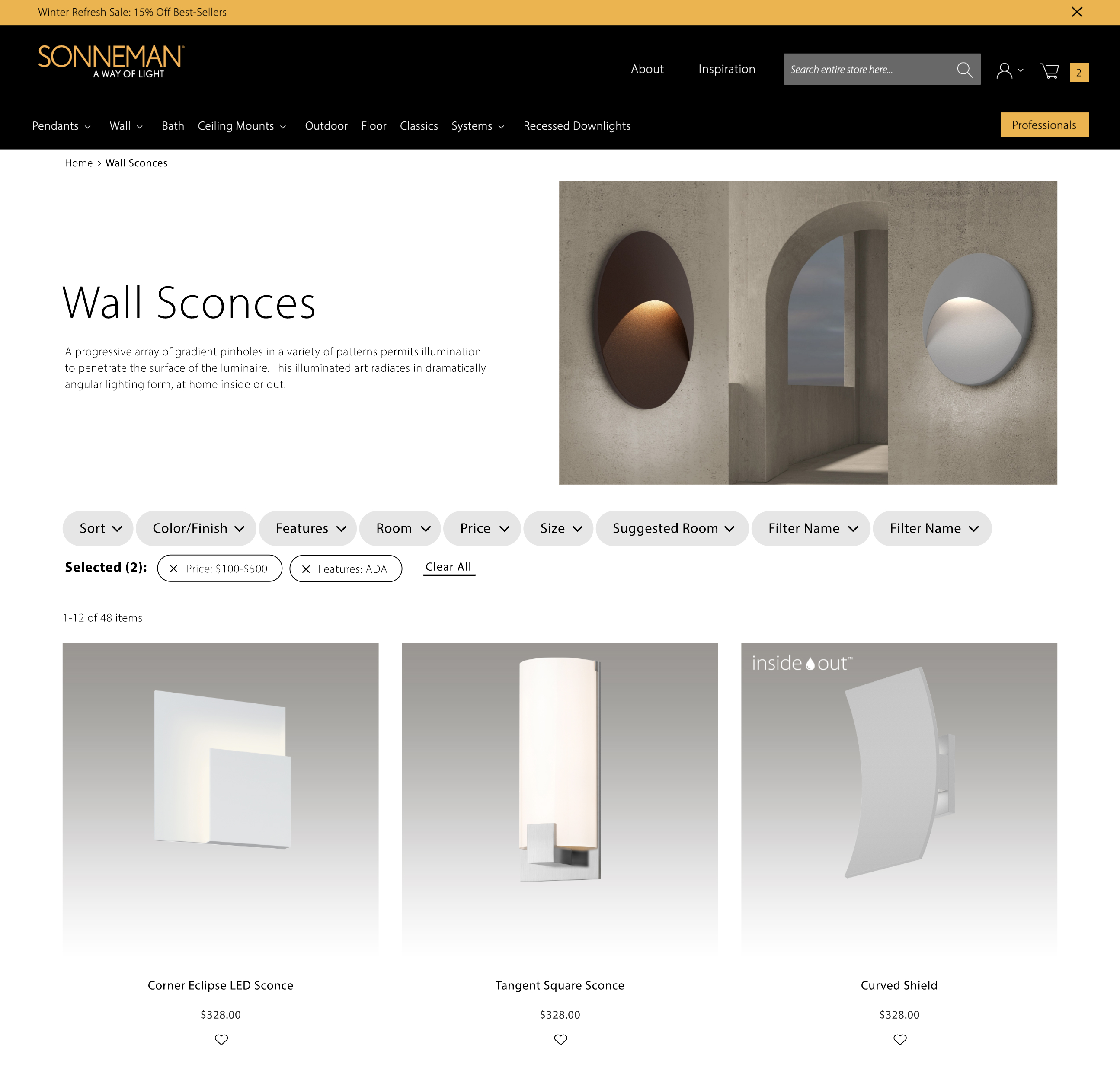
Horizontal navigation with selected filters
Home Page
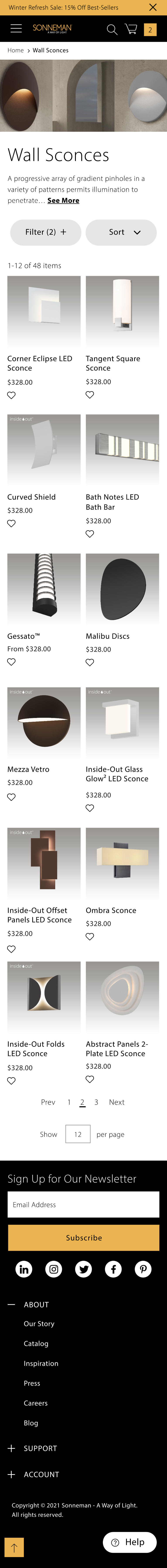
We adjusted the site to be compatible with mobile and tablet devices across all browsers.
We opted for a vertical and stacked layout for both mobile and tablet for easy scanning.
The description text is also truncated to decrease excess vertical spacing.
The filter and sort options are also condensed to reduce clutter on a mobile layout and for overall easier navigation.
Move mouse into the box to scroll through the design
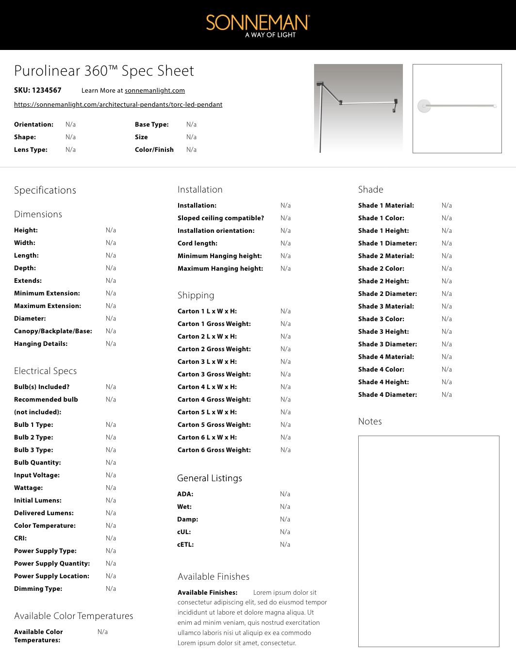
I worked with the backend developer on the team to create a new module that generates a formatted PDF docuemnt of a product’s information. This generator processed custom styling and formatting, product images, and paired values for the specification information iteself. This feature was made available for every product on the site.
For this project, I got the opportunity to develop features that specifically targeted improving the user experience according to best practices. It was an interesting experience to learn UX principles and best practices from a backwards approach -- learning the importance of such features while developing them.
It was an important experience that helped me bridge the gap between design and development communication.