
Zen's goal is to help you improve your posture and how to better your ergonomic health by providing virtual posture coaching sessions, habit reminders, and an array of media and content to feed your mind.
Scroll down to view more.
Sole Product Designer who worked on...UX/UI Design, Wireframing, Competitive Analysis, Behavioral Research, User Interviews, User Flow Mapping
Jan - March 2021
Adobe XD, Figma, Adobe Creative Suite

At the start of the COVID-19 pandemic, Zen (originally PostureHealth) was launched as a solution presented to remote workers who were looking for ways to improve their at home set-up and ergonomics.
Zen was experiencing a low user conversion rate. After about a week of using the app, over 50% their users would stop using Zen or use the app less frequently compared to the first week of signing up.
But why was this happening? Why were users not coming back to Zen?
From conversations with the CEO and CTO, I learned more about Zen's current state. I also took a look at Zen's user feedback surveys to gather more context.
I discovered two things:
Users fail to find value in Zen due to dissatisfaction with Zen's inconsistent user interface.
Understand our users' frustrations and improve the in-app experience to better help users improve their posture and ergonomic health.
Conversion will be determined by measuring the percentage of regularly returning users. A regular returning user would use Zen at least 3 times a week.
For this project, I worked on a small team. Zen is a startup company, so I worked directly with each team member.
We broke the process into multiple components to throughly investigate areas of improvement for Zen. I based my suggestions off of my own research of best practices from the Nielsen Norman Group.
The process was made up of 3 stages, with steps within each stage: empathize, conceptualize, and design.
We also worked in sprints to divide the entire project into smaller phases. That way, we could ship each phase as it was completed to our current users. This would allow us to have a pool of users to test each phase and provide feedback. Each sprint would begin with a kickoff meeting with the entire team to define the goals and deliverables for the sprint. Then two design critique sessions would follow before ending with a final presentation of the deliverables.
Our design process
To dive deeper into our users' problems, we need to uncover specific pain points. How will we understand our users' frustrations?
Prior to joining the team, Zen had just pushed out their latest release and user interviews had already begun. After our problem discovery, I conducted the remaining interviews with our CTO, Alex, who also doubled as our data analyst. We met with our current users through a video call. We asked them questions that aimed to understand their frustrations with the app experience. Their answers became our qualitative data points.
What did we ask?
To narrow our focus on user pain points and motivations, we decided to use affinity mapping as a way to collaborate with the entire team affinity map to organize our qualitative data points collected from our user interviews. We organized the answers into groups and summarized them based on similarity.
The pain points we were able to identify:
These key points helped to inform our strategy moving forward. We now know these are what our users want and need, thus, are the key points we need to focus our improvements on.
Gathering user answers
Sorting answers into groups based on similarity
Overwhelmed by the new insights, we needed to prioritize organizing the findings and form a strategy. How can we find potential solutions?
Kickstarting our secondary research, we began with affinity mapping.
To find opportunities of improvement and identify successful design strategies used by Zen's competitors, I conducted competitive research on direct competitors (posture correction applications), mobile fitness apps, and productivity apps with well-known onboarding systems.
Zen's two competitors were Upright and Brightday.
Both posture correction apps have separate screens for when a user begins a posture session, similar to what Zen currently has.
However, both Upright and Brightday employ simple, but clear prompts to guide the user during their session. Thus, effectively removing any barriers of confusion.
Additionally, Upright uses bright visuals and a avatar character named Avi to further illustrate such guidance.

Clear messaging and visuals within the Start Session and In Session screens
(left to right: Upright, Brightday)
Common patterns from fitness apps, like Nike Training Club, Apple Fitness, and Orange Theory were referenced to create our posture session certiticate, education center, and activation center.
The most reoccuring patterns were:
These strategies successfully created an gamified experience that is curated to the user and their target goals. This was done while keeping their designs minimal but clear.
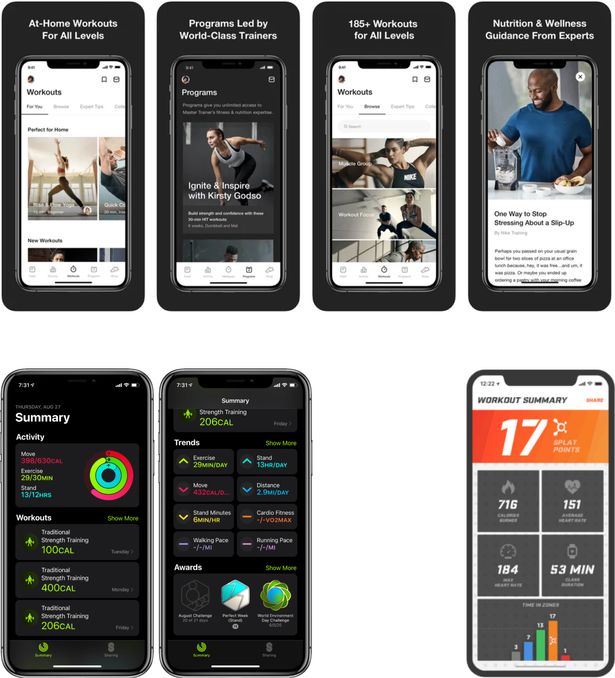
Personalized, informative, and with clear visual hierarchy
(from top to bottom, the left to right: Nike Training Club, Apple Fitness, Orange Theory)
To redesign Zen's onboarding process, we referenced well-known strategies used by Headspace, Duolingo, and Slack in their onboarding experiences.
The most reoccuring patterns were:
These methods are important because they create an onboarding experience that is engaging and easy to follow. Users feel more inclined to finish the entire process becasue there are interactive and visually appealing components that continuously grab their attention while being easy to understand.
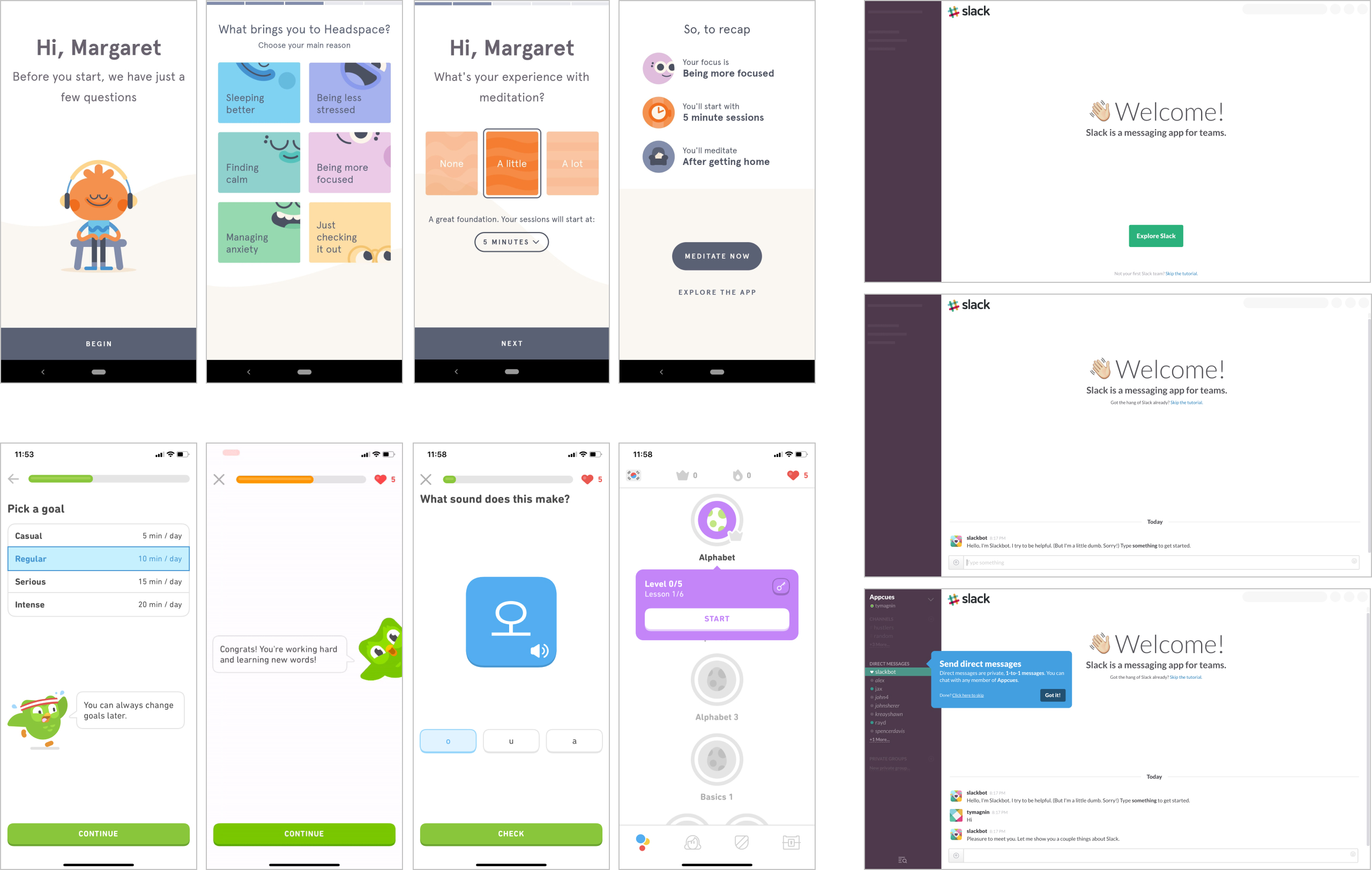
Interactive onboardings with simple but engaging visuals
(from each column of images, top to bottom: Headspace, Duolingo, Slack)
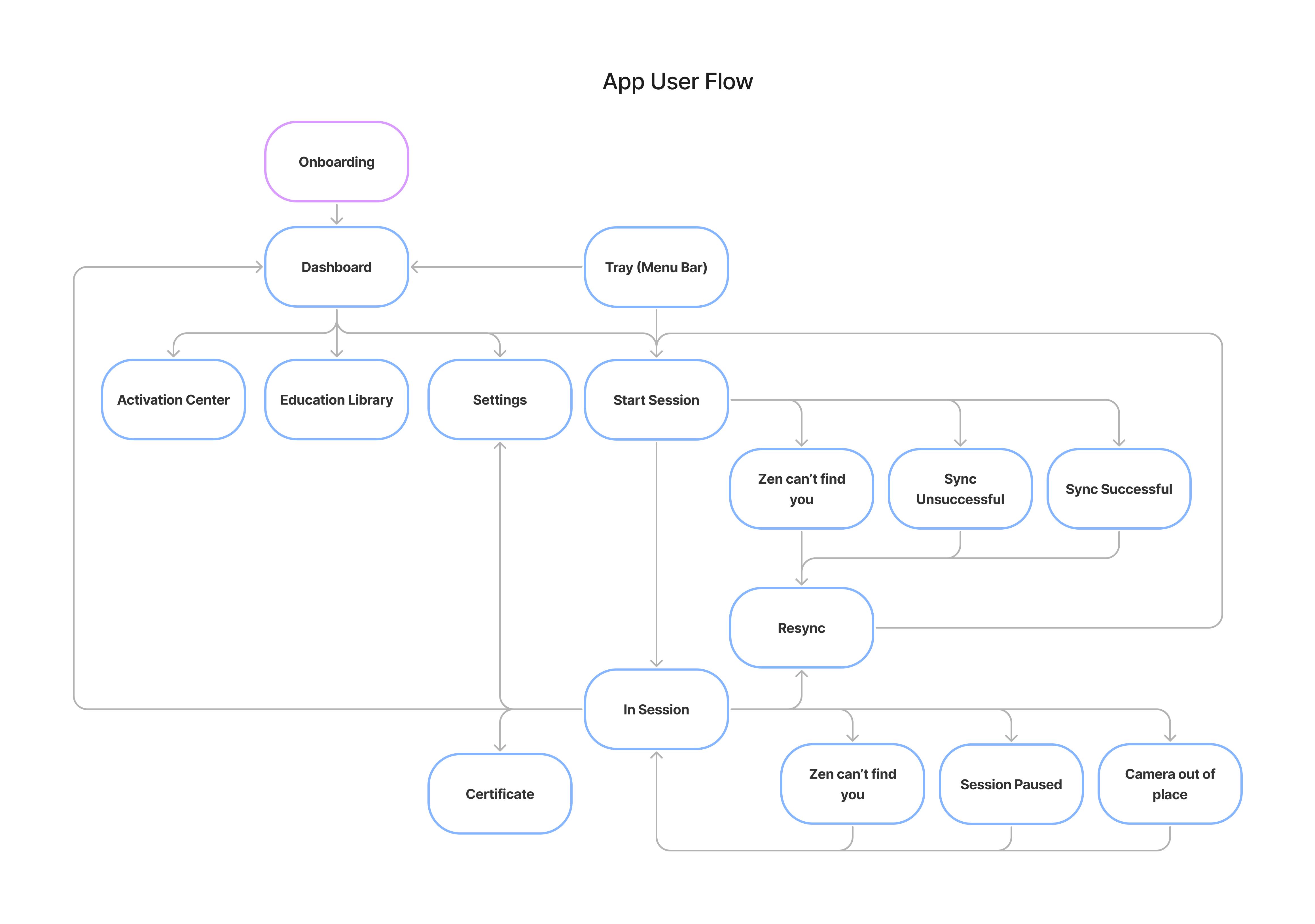
I designed user flows for the overall app user flow and the onboarding user flow. As a team, we brainstormed and walked through each user flow together. Mapping out our user flow allows us to not only assess the current state of of the app's experience, but also identify the gaps/inefficiencies and begin hypothesizing how we might address those problems.
At a high level, this user flow maps out how a user would experience the app after completing the onboarding process. From our interviews, users found it difficult to navigate from screen to screen due to the ambiguity of buttons and icons.
Gap identified: unclear navigation and guidance when a user attempts to start a session or move to different screens.
The onboarding process is broken into three parts: the overall flow and two smaller flows that reside within the overall flow.
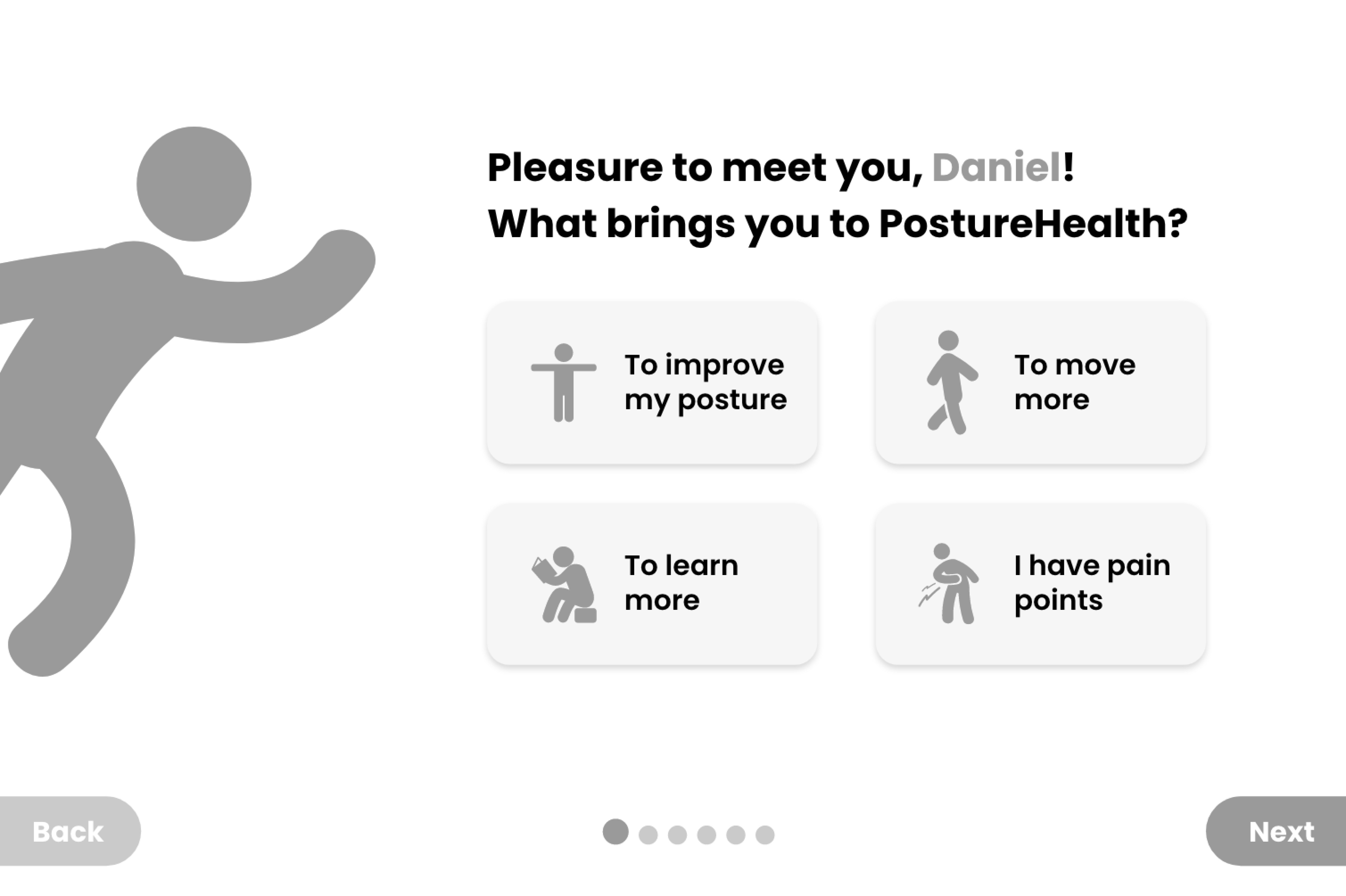
The original onboarding flow started off with asking the user: “What brings your to Zen?”
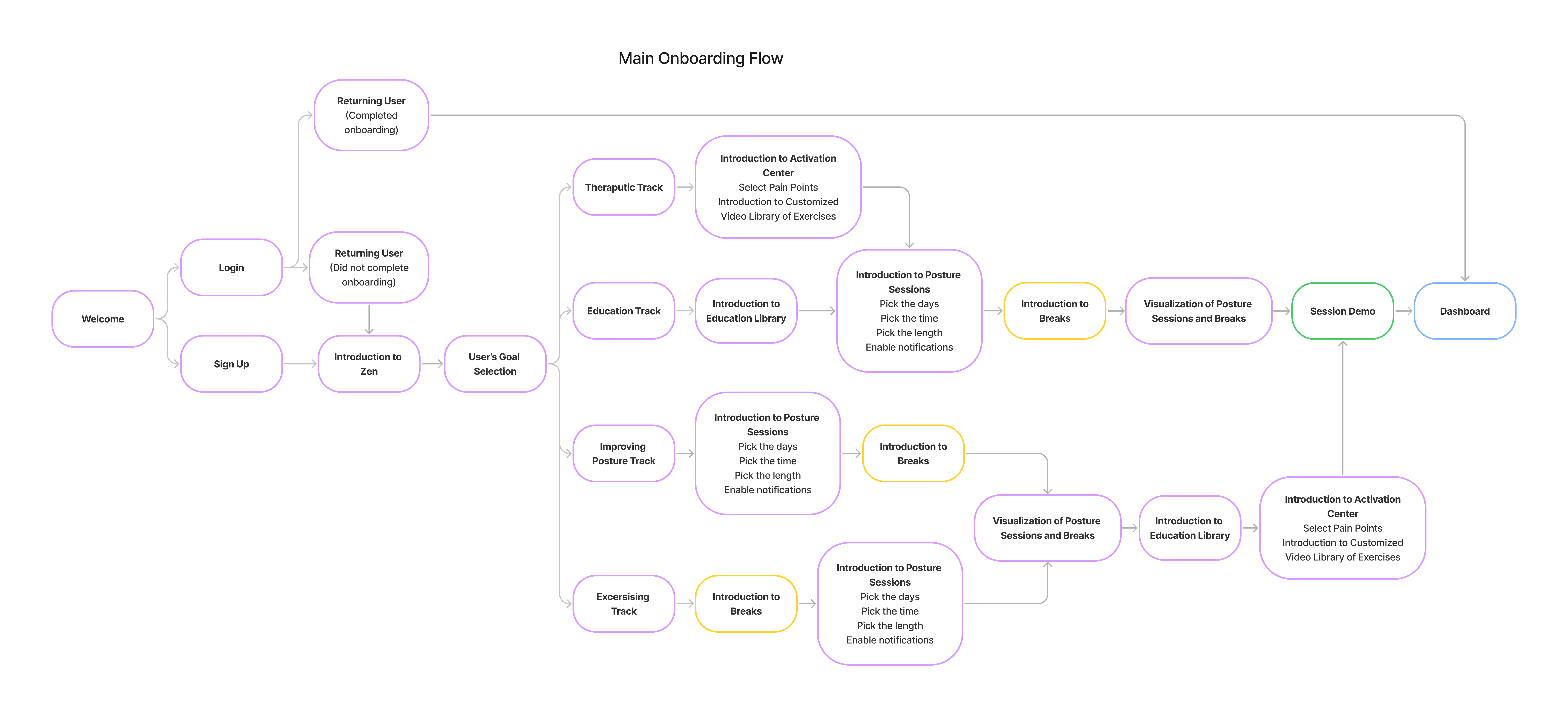
Overall flow of the onboarding that begins with user motivations
From my competitive research, I noticed that similar questions often kicked off app onboarding processes and sometimes the process would deviate based on the user's answer. I decided to design the new onboarding process with this “choose-your-own-adventure” approach to personalize our users' experience. This would target one of our key pain points from the results of our interviews and affinity mapping: Lack of user control over app personalizations.
Additionally, I hypothesized that if users were introduced to specific features that aligned with their motivations, they would see the value that Zen could bring to them. Thus, this also addresses another key pain point: users being unaware of existing customizations.
Gap identified: onboarding process is not personalized and thus, users may see a lack of purpose if Zen does not fit their needs.
We added a demo section to the end of the onboarding flow after realizing a crucial issue: the first iteration of the onboarding process was too long. After gathering this feedback from the team, I took a step back and revisited my competitive research.
Gap identified: a long and tedious onboarding process could make users disinterested and leave before seeing Zen's true value
Interactive posture session demo user flow
I noticed in productivity apps, their onboarding process had two main goals:
They achieved these goals by only asking the necessary questions to get a user started with using their app. They would introduce other features later using tool tips or nudges within the app after completion of the onboarding process. Additionally, Slack and Duolingo included an interactive section within their onboarding process to allow the user to get to know the app as soon as possible.
Taking inspiration from those competitors, I removed any steps that were not related to Zen's main features (posture sessions, break sessions, and media content sections) and included an interactive demo of a posture session experience at the very end of the onboarding process.
Early brainstorming sketches for demo flow. I also referenced these sketches later when designing the In Session screens
Lastly, the original break session flow within the overall flow was modified to include more customization options. This also targets same key pain point from earlier: Lack of user control over app personalizations.
Gap identified: only offering automated options, no customizations
The original break session flow only included options to set up notifications at automatic times. In the redesign, I kept the options for automatic times and added options to set custom times. The automatic times were kept because they would act as default settings until a user chooses to customize their notification times.
Our secondary research allowed us to move forward with our strategy to target these pain points and gaps of opportunity by deriving design solutions.
And now, from what we've gathered, we've proposed some solutions.
We had a tight deadline and our sole developer needed to start building soon. There were key questions that we needed answered before we started:
Once we answered our burning questions, we began our design sprints.
Rome wasn't built in a day - and so wasn't Zen. Our design stage was often non-linear and involved many trials, errors, and most importantly, testing with our users.
Kicking it off, we have the onboarding process. In the original design, the onboarding process was already broken into simple steps, similar to our competitors. However, the process was unable to highlight Zen's main features well.
Thus, we wanted to:
Original design
Iteration 1 wireframe of an onboarding screen with an early draft version of the new avatar
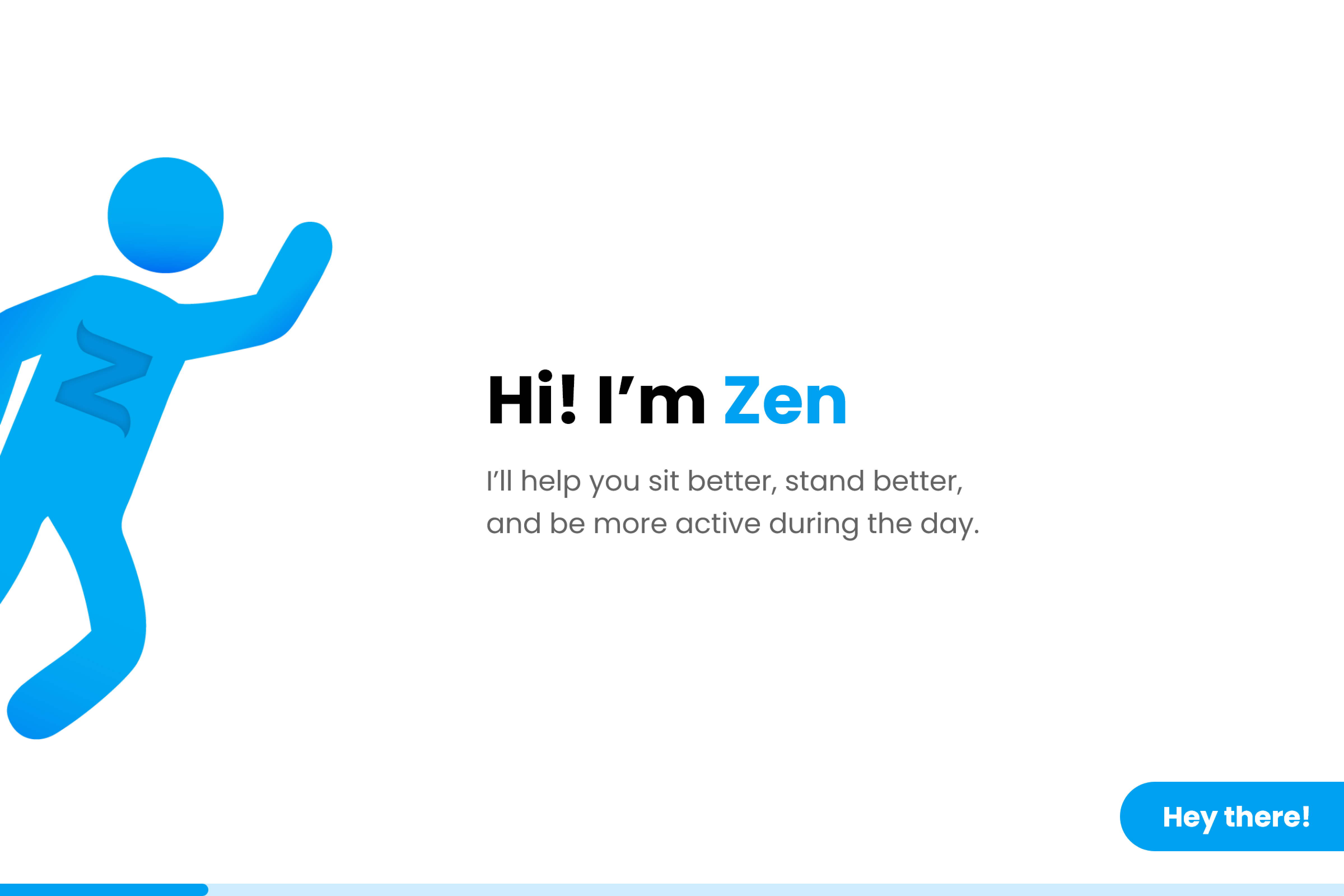
In the first iteration, I suggested that we use the existing avatar within the posture sessions to guide the user thorugh the onboarding process.
Using a memorable character to communicate with the user throughout the onboarind process was a common pattern in our competitors.
Daniel and Alex suggested we breathe life into our avatar by giving them a name and making them our mascot. They were named Zen, which, the company was later renamed to!
Abby then created the character design for Zen, while I provided visual guidance for Zen's personality, behavior, and how Zen would interact with the user thorughout the onboarding process and within the app.
I also updated Zen's buttons in their design system to use rounded or circlar shapes, to match our new avatar's friendly and approachable personality.
Did not have secondary button at all.

Included secondary button, updated tertiary button design, and kept existing hover and clicked states

From my competitive research, progress indicators were great ways to keep users motivated to continue with the onboarding process. Thus, I brought that element over from the original design, but updated it to be more simplified to make room for the new avatar.
I kept the existing CTAs and added a “Skip” button. Our competitors showed that providing users with the choice to skip directly to the product allows them the freedom to experience the app at their own pace.

Iteration 1 of an onboarding screen with the new avatar
Iteration 2 of an onboarding screen
In the second iteration, we noticed that the current progress indicators were not scalable - would we have 15+ circles if we had 15 steps in total?
Thus, I decided to design a progress bar instead. This still would inform the user of their progress and not create visual clutter.
We released the second iteration to our existing users for testing and we discovered a few things after interviewing them:
Based on their feedback, I made the following changes:
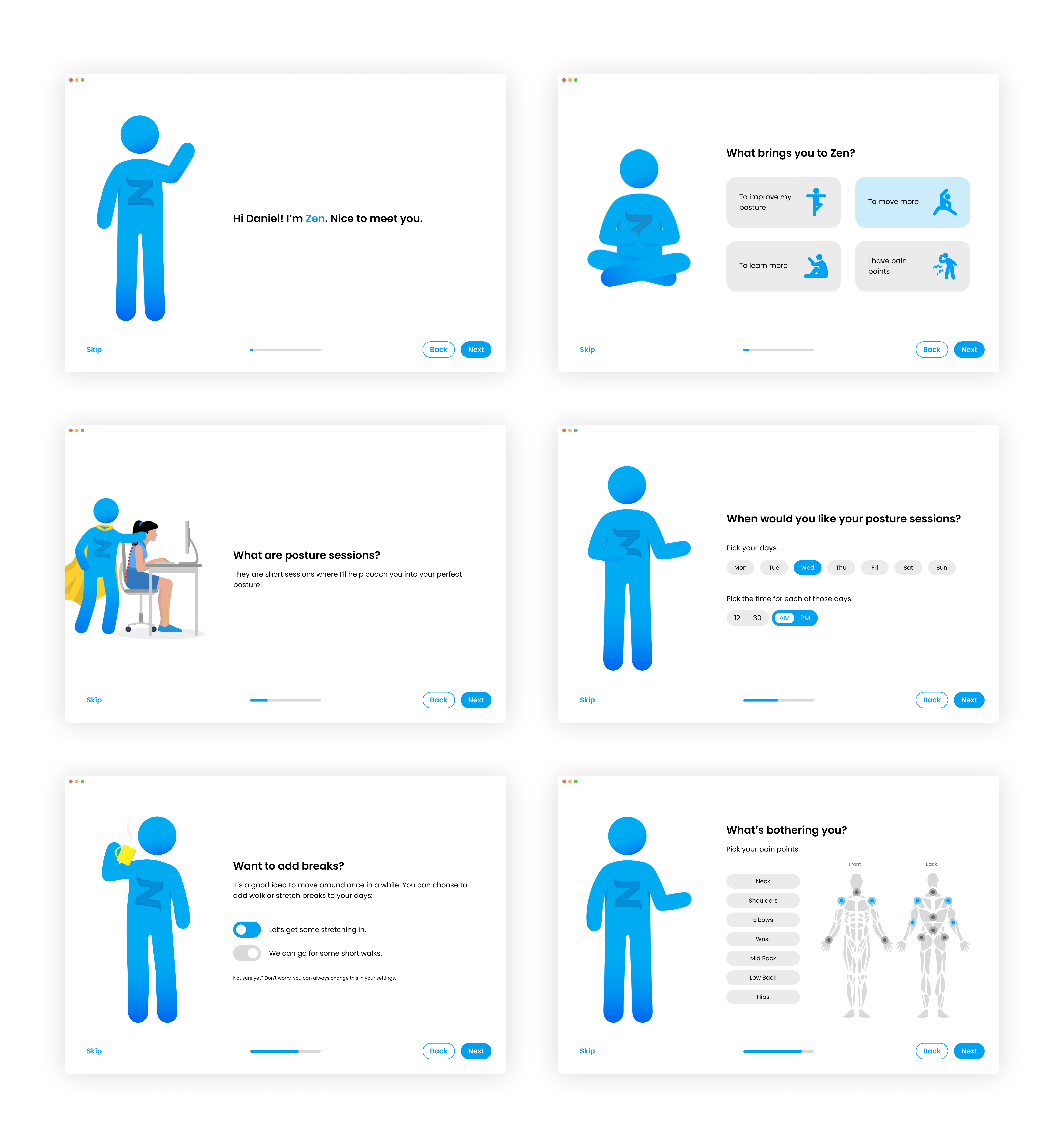
Iteration 3 of some of the onboarding screens
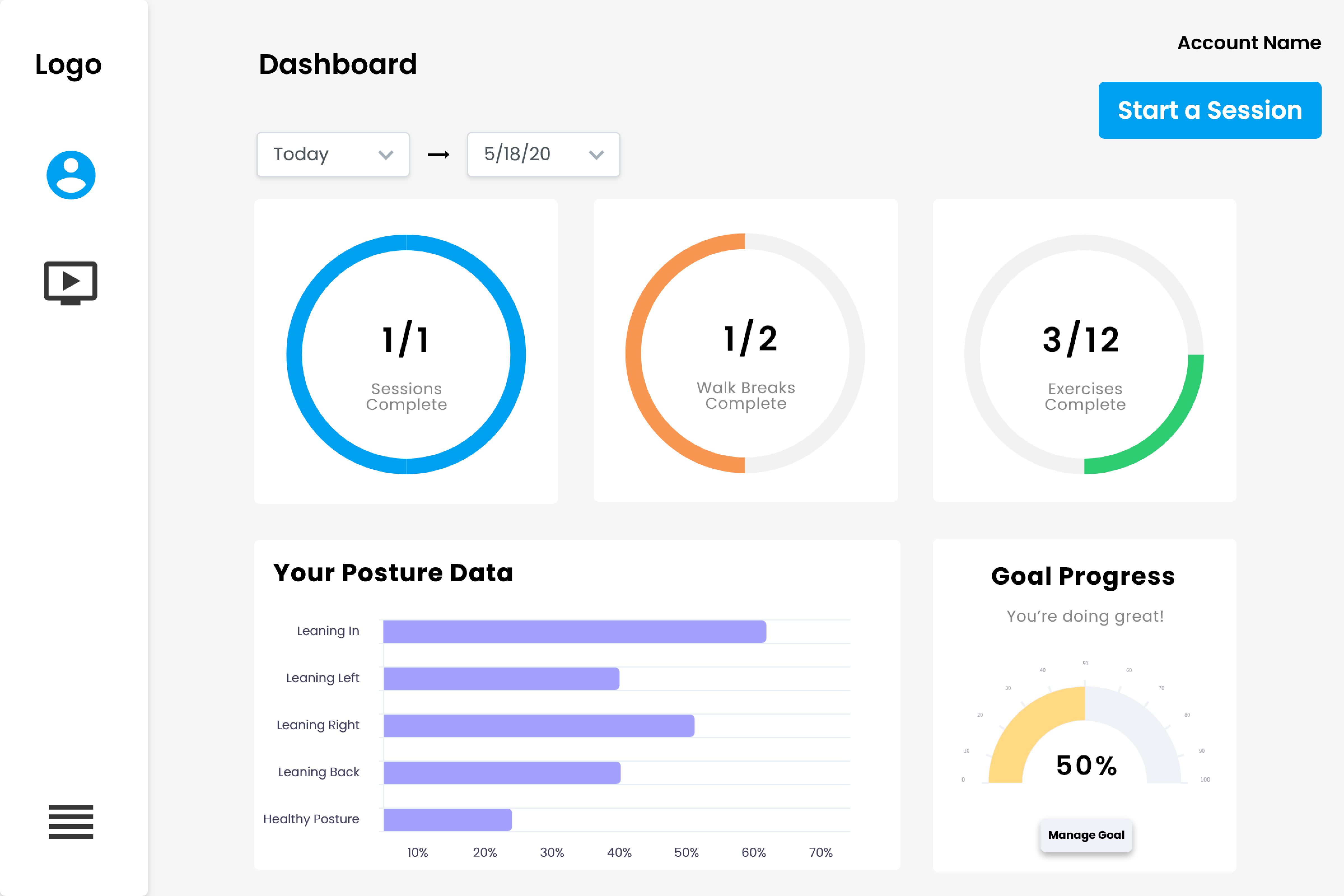
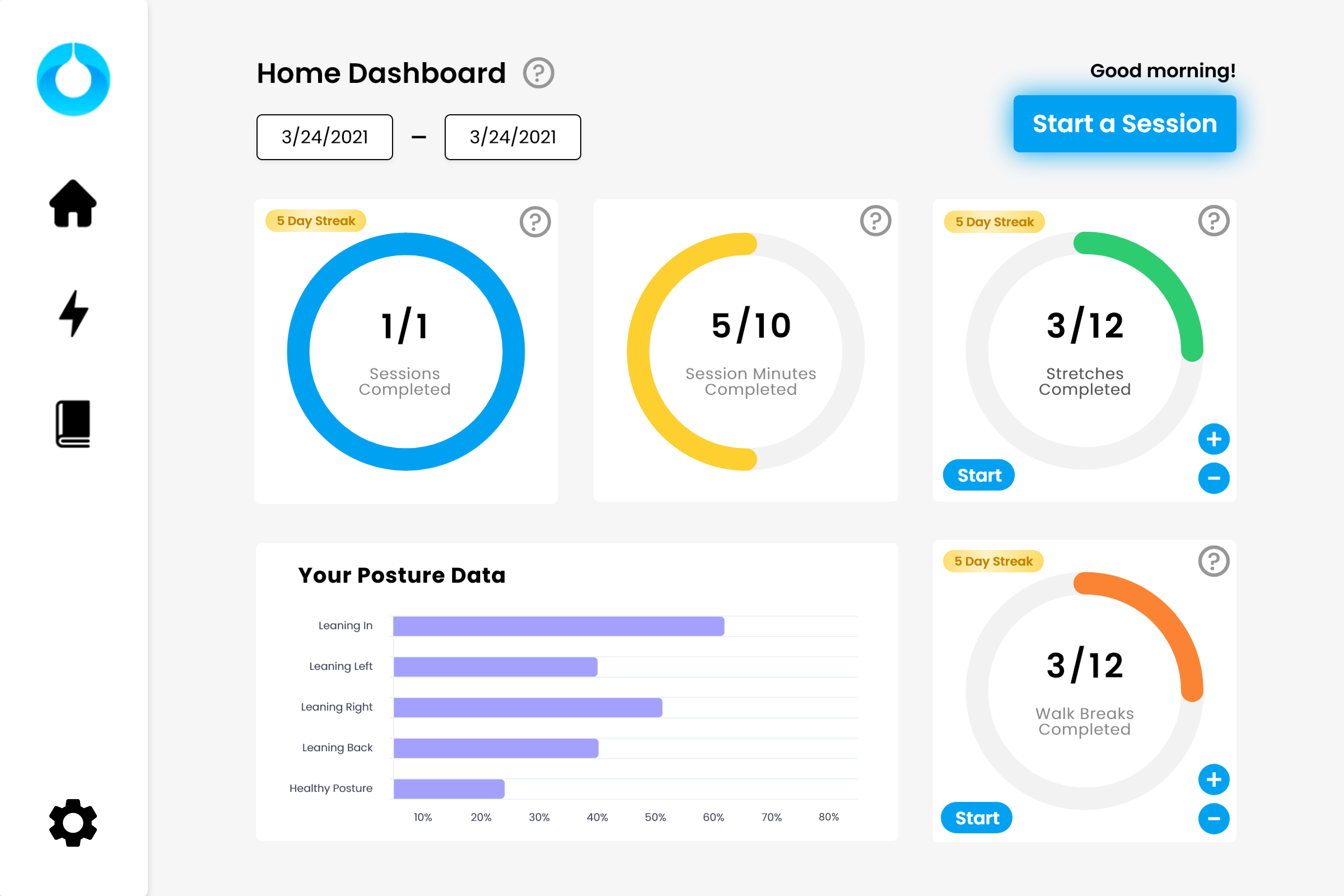
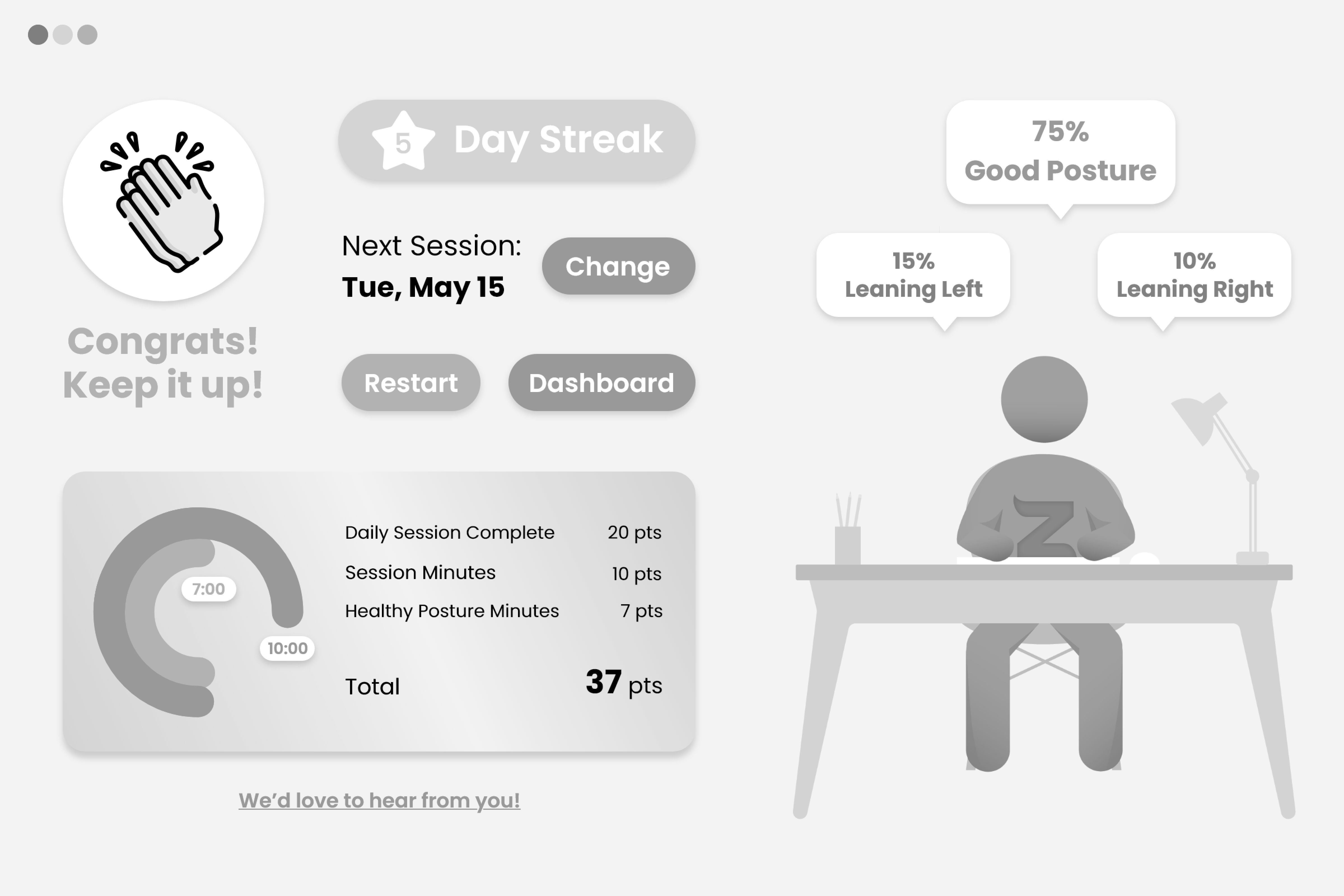
The Dashboard is the home screen for our users. It presents them with a summary of their posture improvement progress with data.
In the original Dashboard, it lacked interactive elements and users found it difficult to navigate outside of this screen. If they wanted to update their daily goals, they would not know how to find the settings page.
Original Dashboard design
Iteration 1 of Dashboard with minor changes
In the first iteration, instead of making the user search for the options they were looking for, I made them accessible from the Dashboard.
I chose to remove the daily goal progress chart because it relayed the same information as the daily goal charts and was no longer necessary.
Additionally, taking inspiration from our competitors, I added badges for daily streaks as a gamification element to keep users motivated.
Lastly, I updated the left navigation with new icons to better illustrate their purpose.
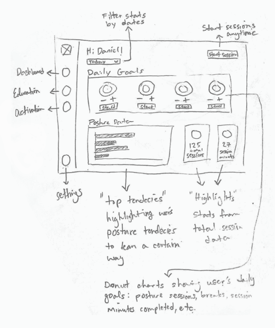
Going back to the drawing board for the second iteration of the Dashboard
In after the first iteration, we discovered that the Dashboard lacked summaries of overall progress. Users would need to use the date range filter to see their accumulated progress.
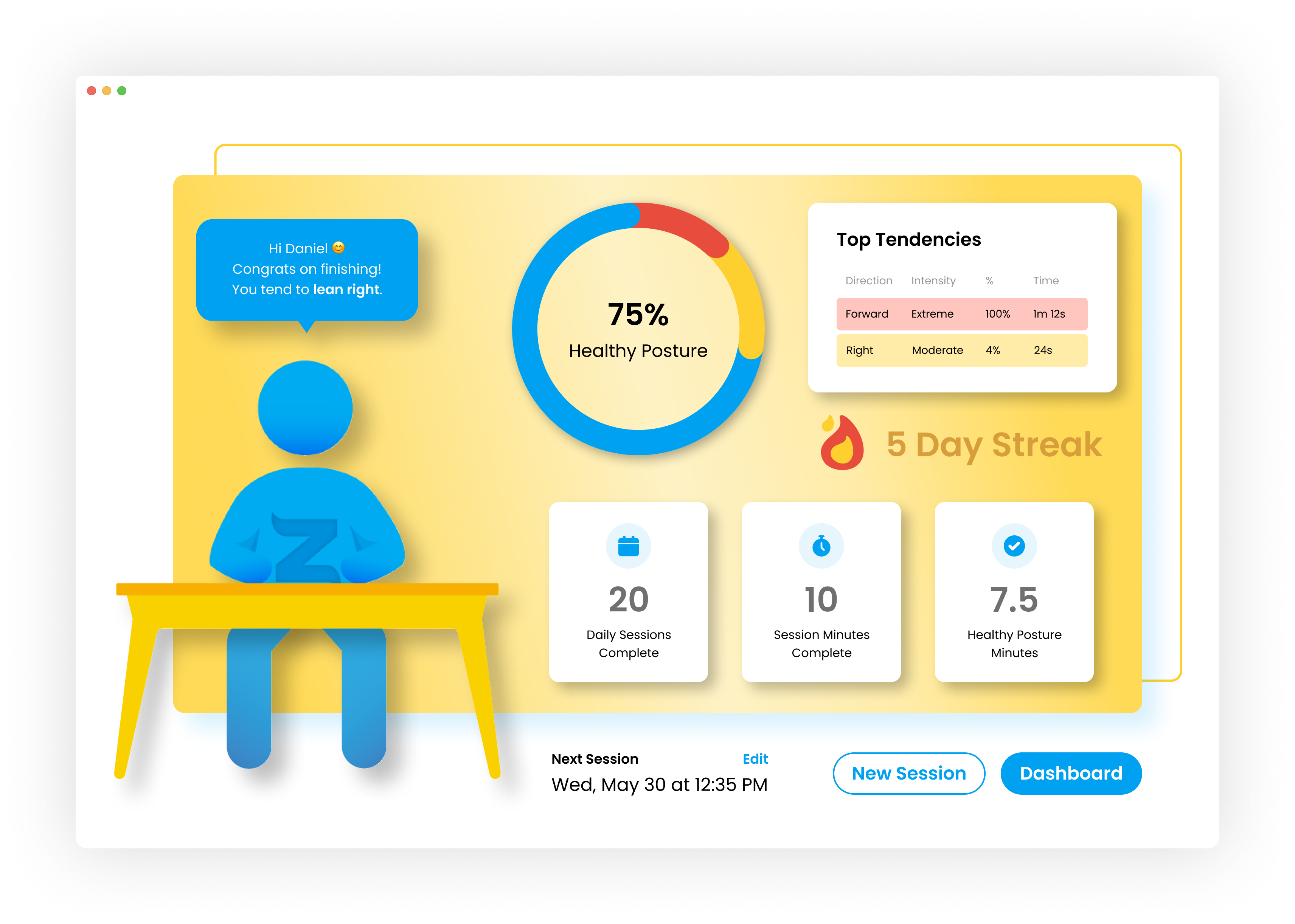
Taking inspiration from our later design of the certificate, I included overall progress statistics, while keeping the daily progress statistics in the second iteration.
I chose to design circle graphs to allow users to see how close they were to 100%, reminding users of their initial motivation to improve their posture and physical pains.

Low-fidelity wireframes of the second iteration of the Dashboard
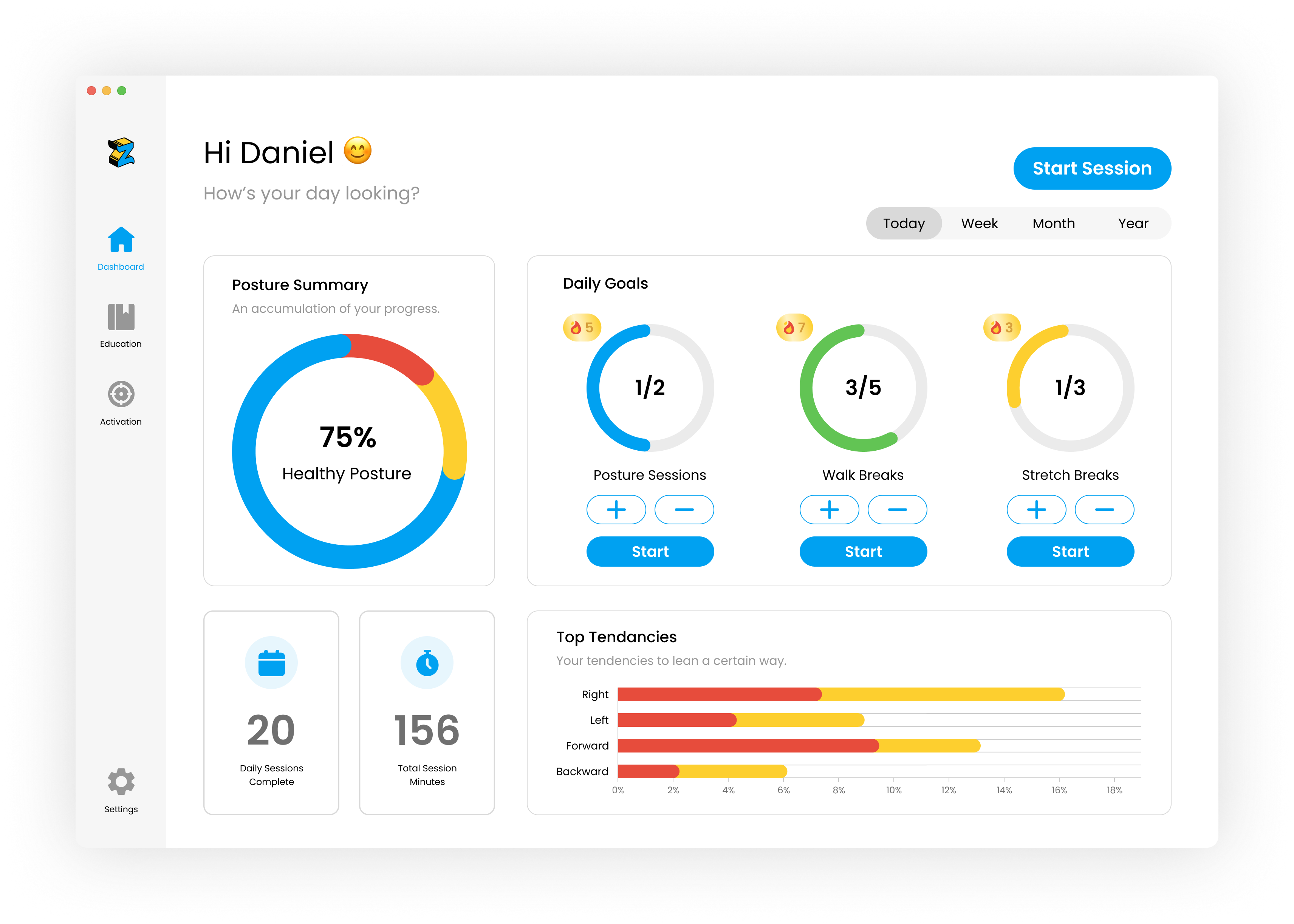
High-fidelity design of the second iteration of the Dashboard
According to users, the new icons were still confusing to understand, thus, I added labels underneath each icon for more clarity in this second iteration.
I also updated the design of the icons to match the design system better.
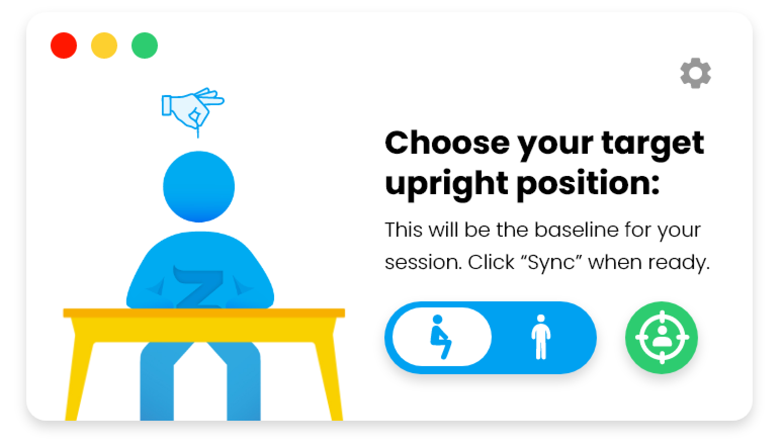
When a user wants to start a posture session, they will first encounter the Start Session screen that prepares them for the session. The original Start Session screen did not meet best UX practices:
Original Start Session design
I first created low-fidelity wireframes to conceptualize what improvements could be made to meet best UX practices and provide more visual cues to help users navigate this screen.
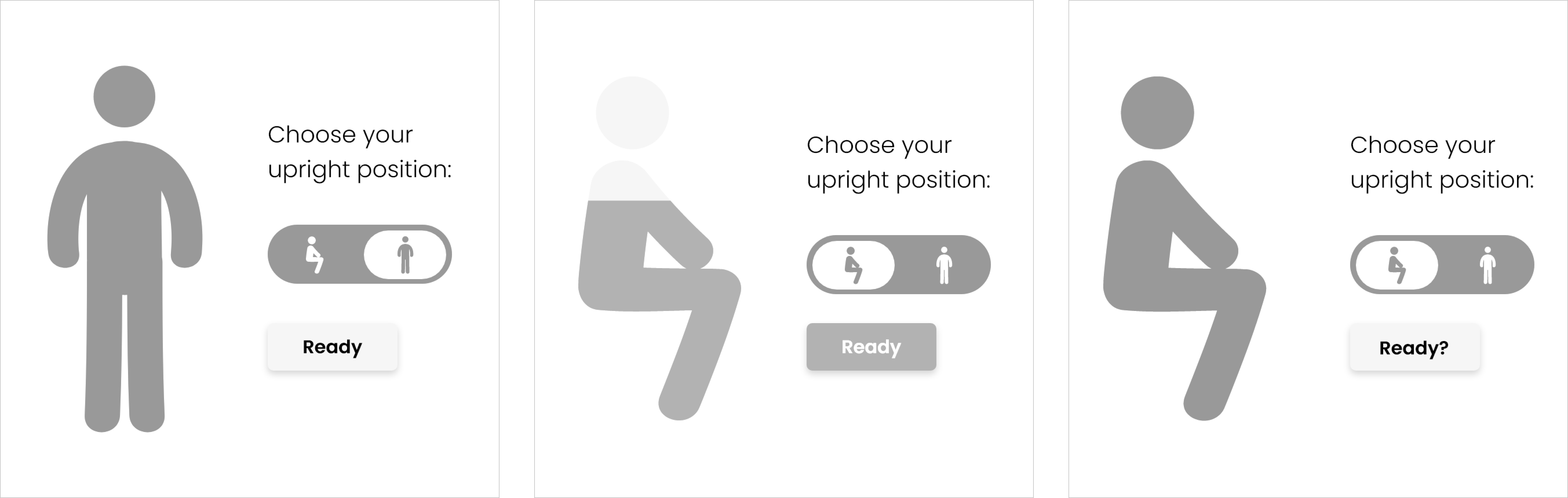
Low-fidelity wireframe drafts of the first iteration of the Start Session screen
With this proof of concept, I designed the first iteration with the changes mentioned above. However, I made a few changes based on feedback from my team:
Low-fidelity wireframes of the first iteration of the Start Session
After releasing this iteration to our current users, we received a lot of feedback:

High-fidelity wireframes of the second iteration of the Start Session
Thus, in the second iteration, I changed the visual layout of this screen, while complying to our size constraints. I opted for a vertical layout to create better hierarchy and guide the user to our main CTA.
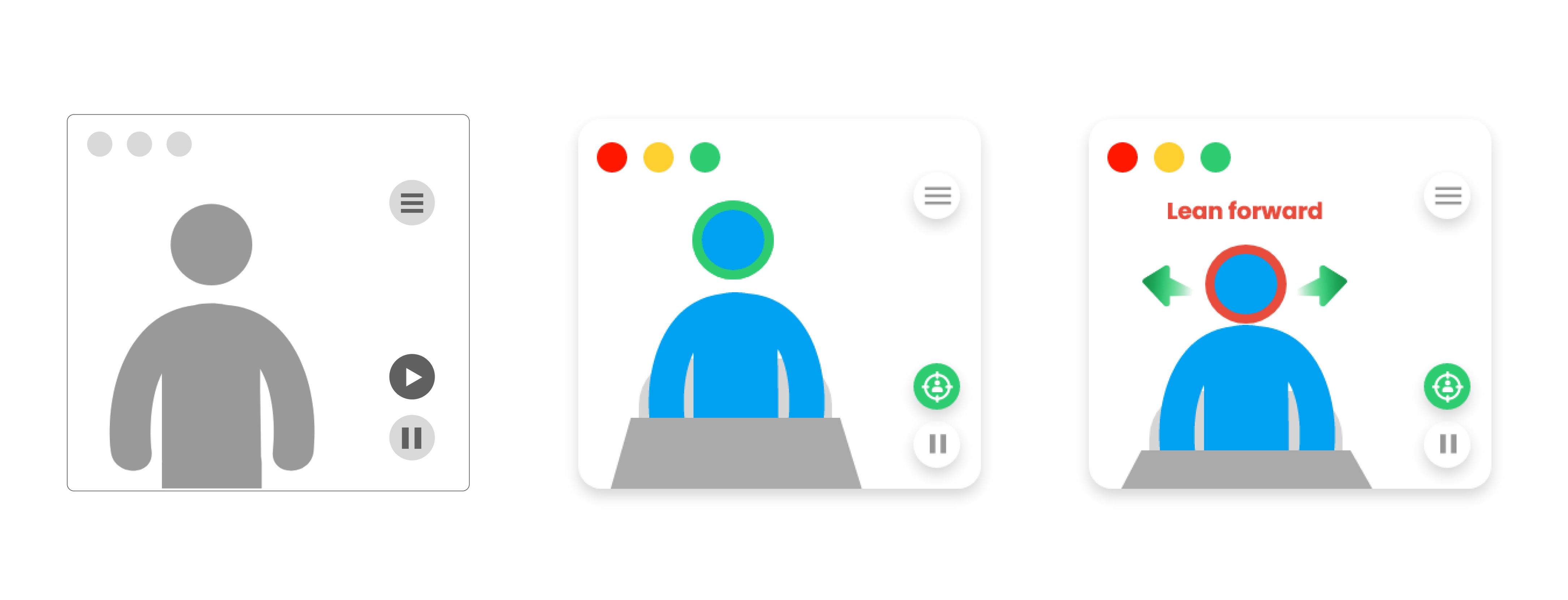
I also included a home button, as well as include the word “sync” along with a new icon to illustrate calibrating with the avatar.
I also included message banners at the bottom of the screen to nudge users in the correct position in the event of an unsuccessful set up.
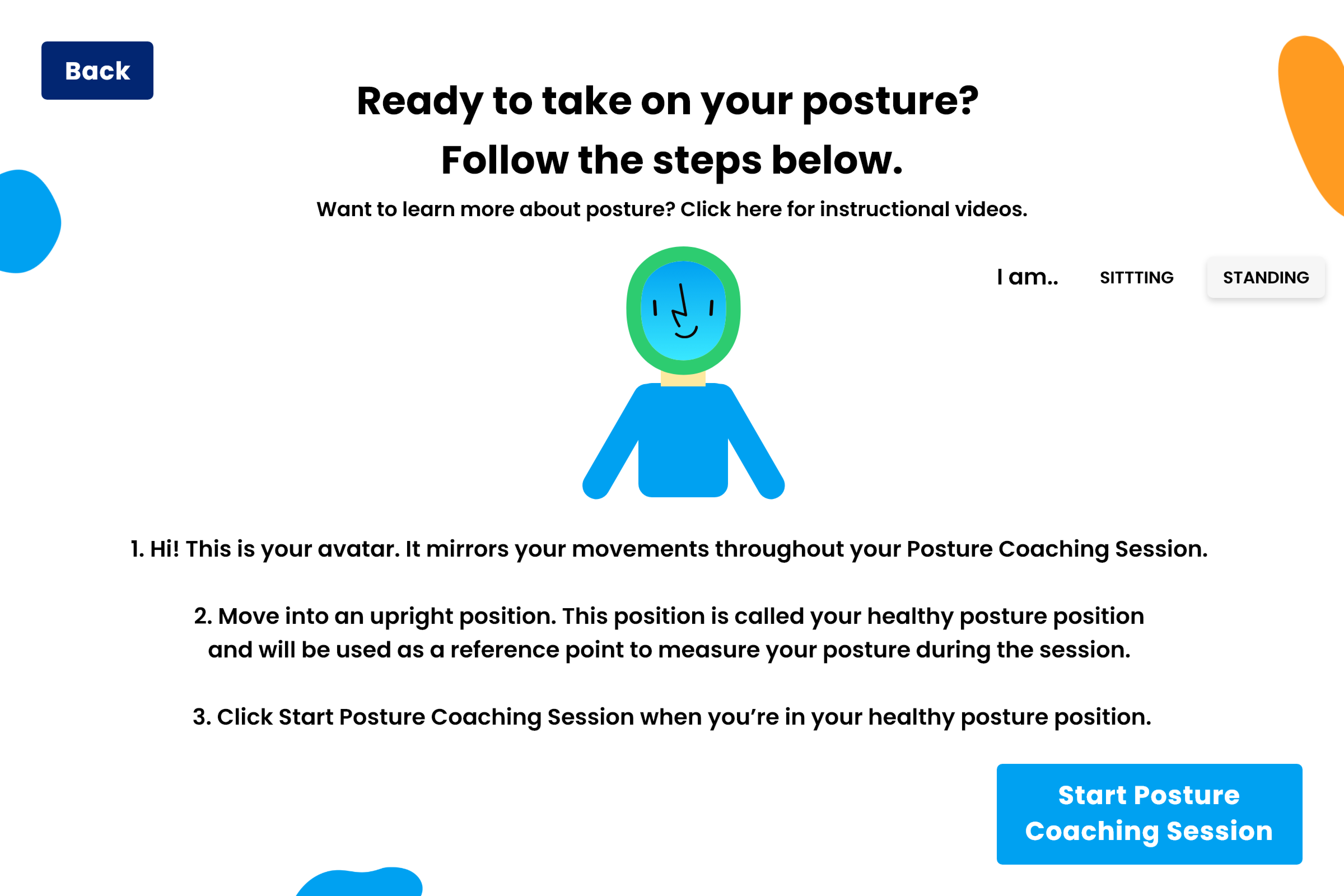
In the third iteration, I updated the message banners to be new screens to give users more prompts and visual guidance.
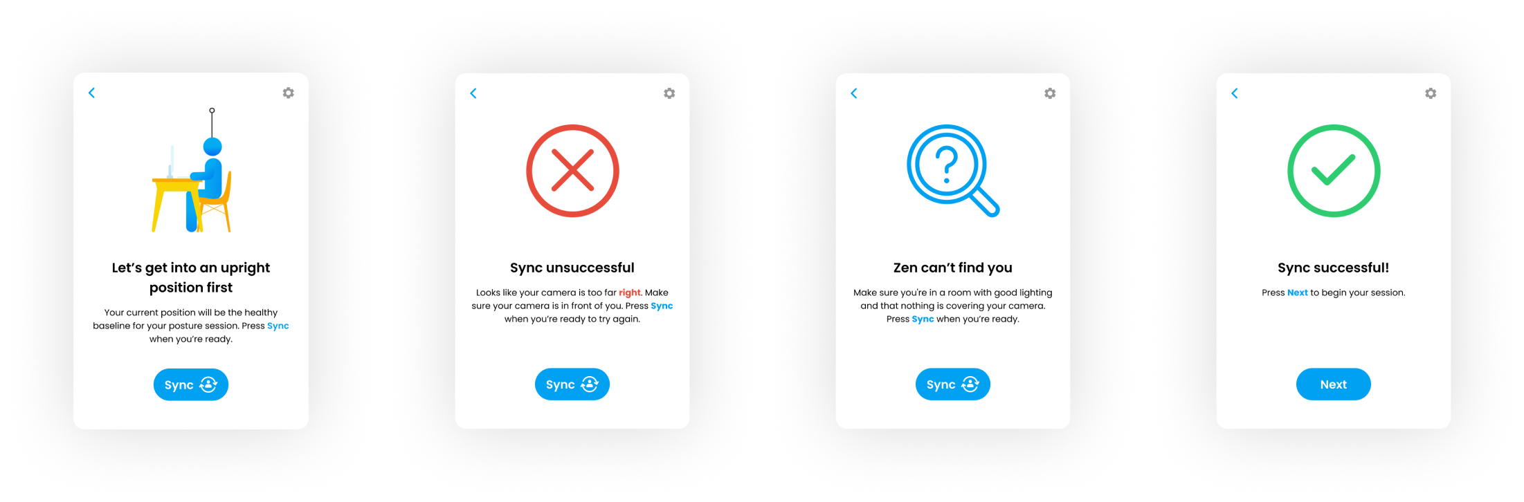
Third iteration of the Start Session screen
After completing the Start Session screen, the user will finally begin the posture session. In the original In Session screen, users often mentioned difficult navigation. They had trouble understanding what the icons and their functions.
Users also mentioned how they prefer to continue working on their computers while the app is running. However, the app would take up a large amount of screen space and make it difficult for users to multitask. Users were also easily distracted by the high number of app notifications.
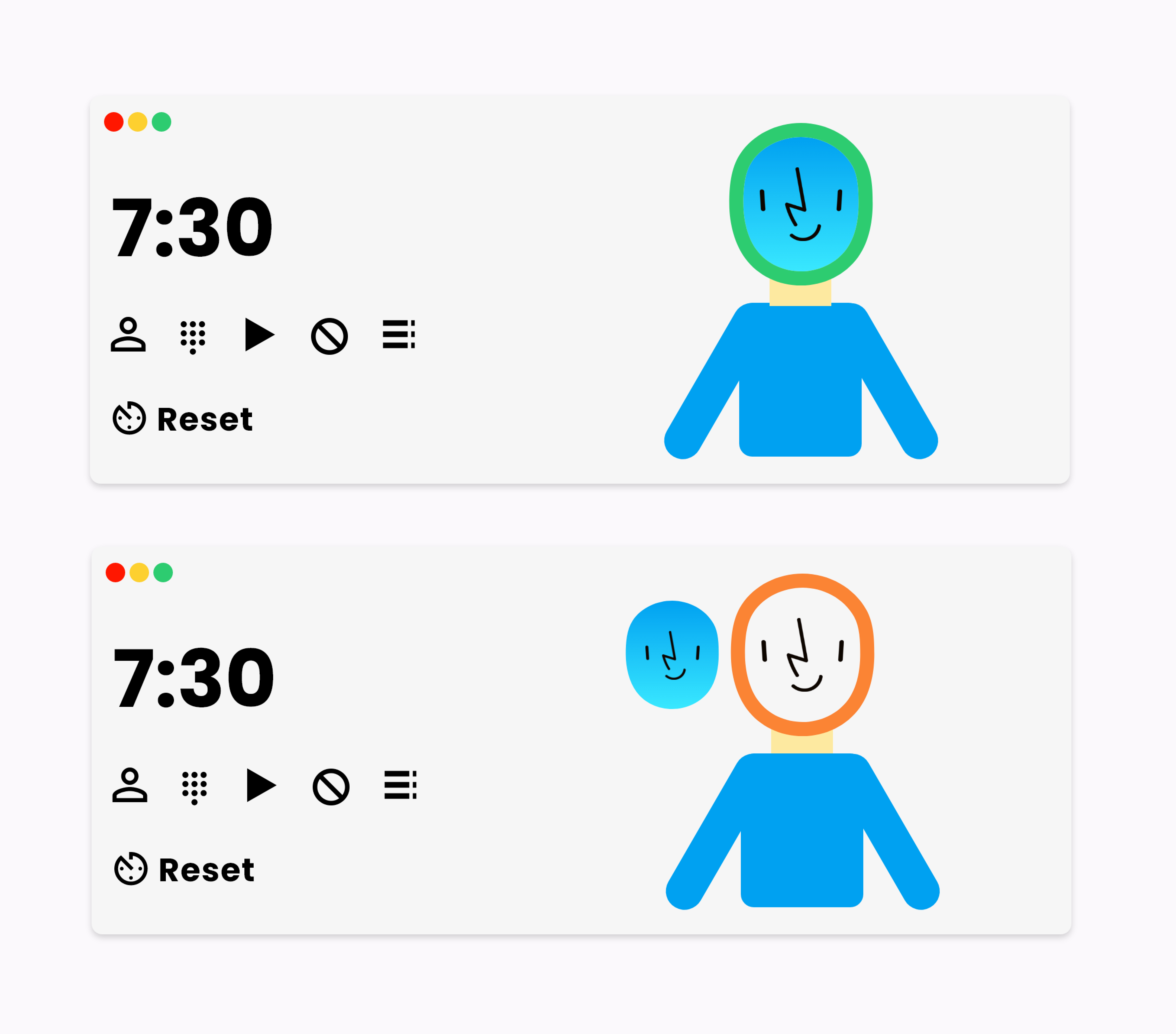
Original design of the In Session screens
Thus, based on my competitive research, our team determined the maximum size constraints for this particular screen. I was tasked with including the necessary functions and the new avatar within this new screen size.
Initial sketch of the In Session screen
Initial draft wireframes prior to the first iteration
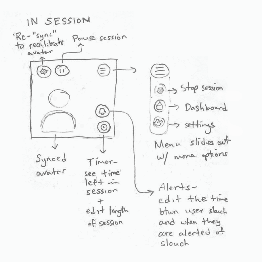
First iteration of the In Session screens
After brainstorming with the team, we revised the necessary functions to include on this screen based on competitive research and user feedback.
As a result, in the first iteration, we decided to include the timer and alert time options to this screen to allow users to quickly access their posture session setting adjust their posture alert times to reduce the frequency of notifications to their preference.
I also updated the design of the icons to clearly illustrate their purpose. However, after we released the first iteration to our current users, they still had difficulty understanding what each button did. I realized that I was under the assumption that every user would understand certain illustrations. Thus, I included a hover state for each button. When hovered, a tool tip with the button label will appear to provide context.
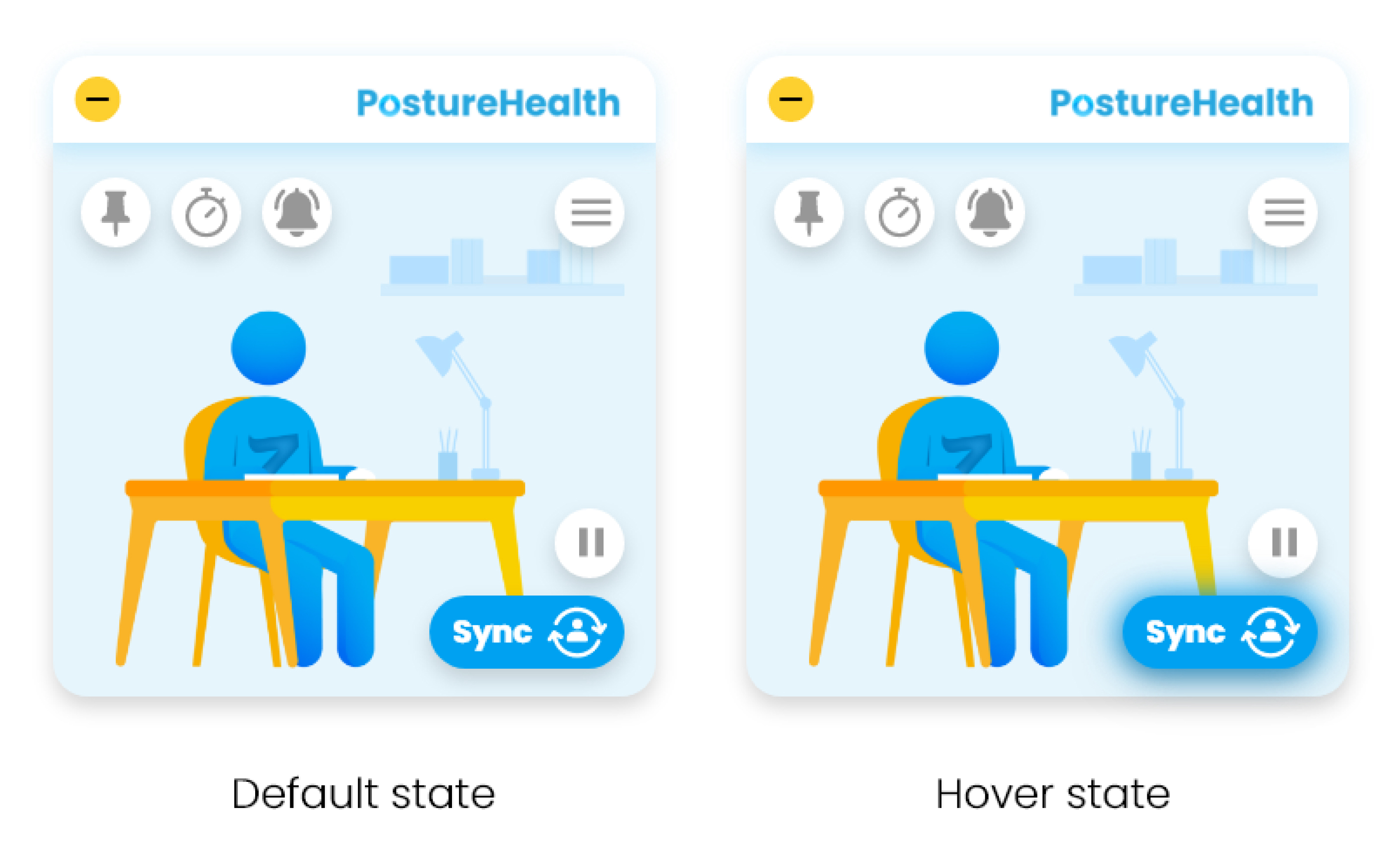
Second iteration of In Session screens
In the second iteration, I also rearranged the buttons based on similarity from our user feedback for easy navigation. Grouping the buttons together would potentially make it easier to direct users to the buttons they are looking for.
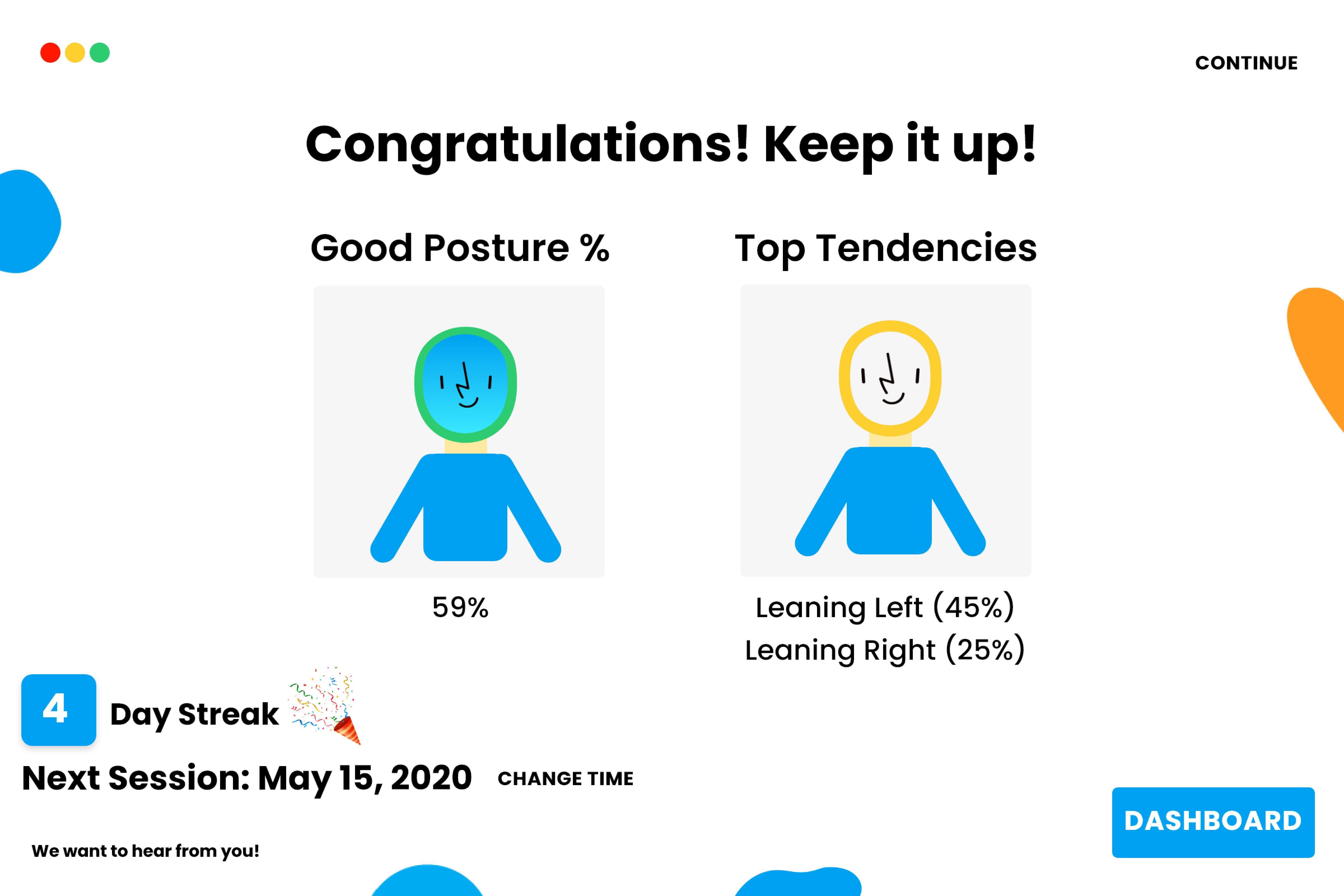
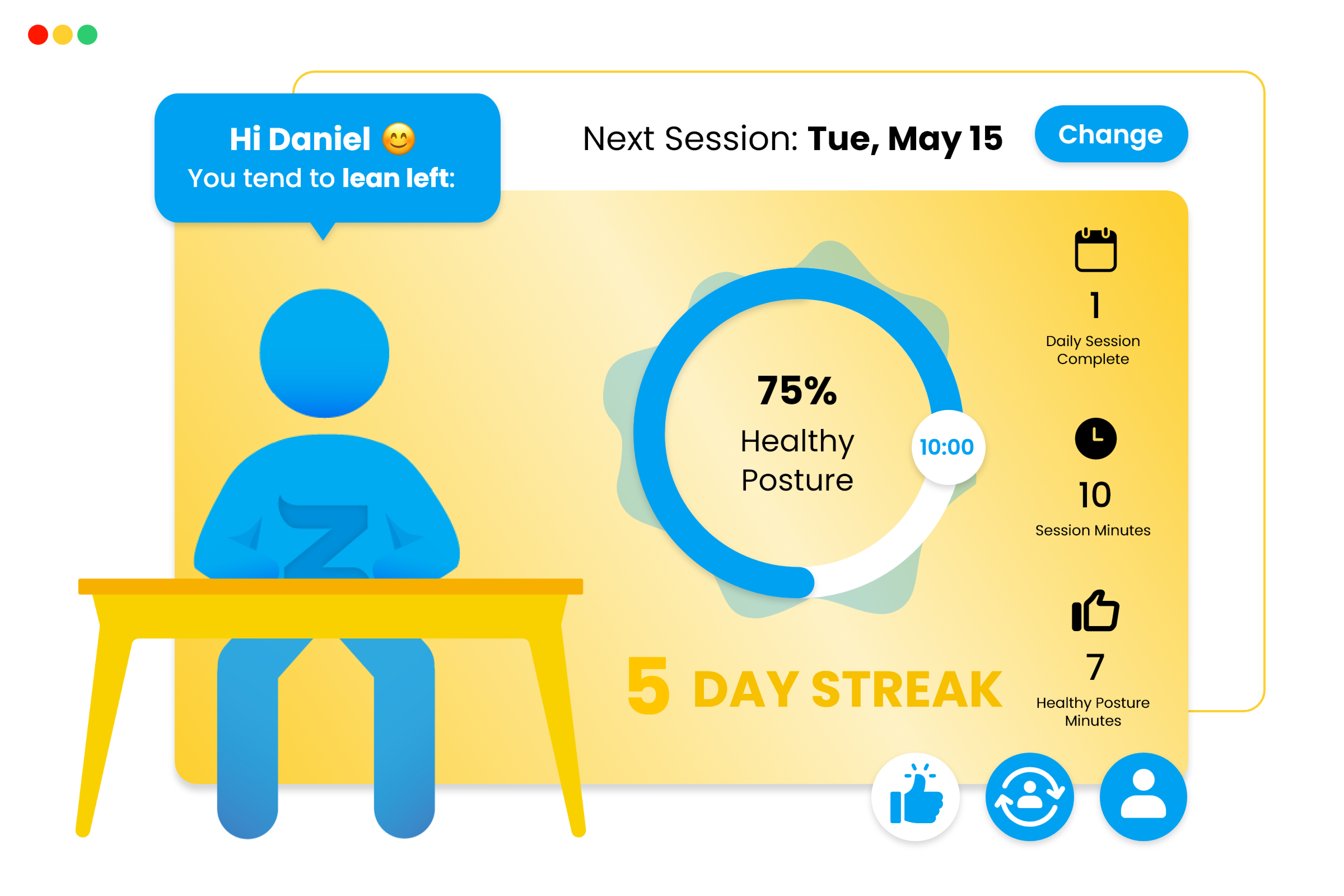
You've made it! After completing a posture session, users will see a Certificate screen. Similar to their Dashboard, it will break down their progress, but showing data specifically from their completed session.
However, in the original Certificate, it did not follow best UX practices.
Original design of the Certificate
The original certificate did not follow best UX practices. The visual hierarchy was difficult to follow and there were miscellaneous design elements that did not contribute to the purpose of the certificate.
Experimental drafts of Certificate screen wireframes
Prior to the first iteration, I took inspiration from our competitors to experiment with different ways to visually convey our users' data.
I designed badges and congratulatory visuals to encourage the user while highlighting specific data. I also added our avatar on the side to highlight the user's posture tendencies with a chat-box-like approach. This connects the user to their avatar.
Thus, in the first iteration, I used icons and enlarged the posture chart to highlight the user's results from the posture session.
However, after we released this iteration, users felt that this screen was too cluttered.
In the second iteration, I created distinct sections and presented them from overall statistics to specific statistics, reflecting that of our competitors.
First iteration of the Certificate
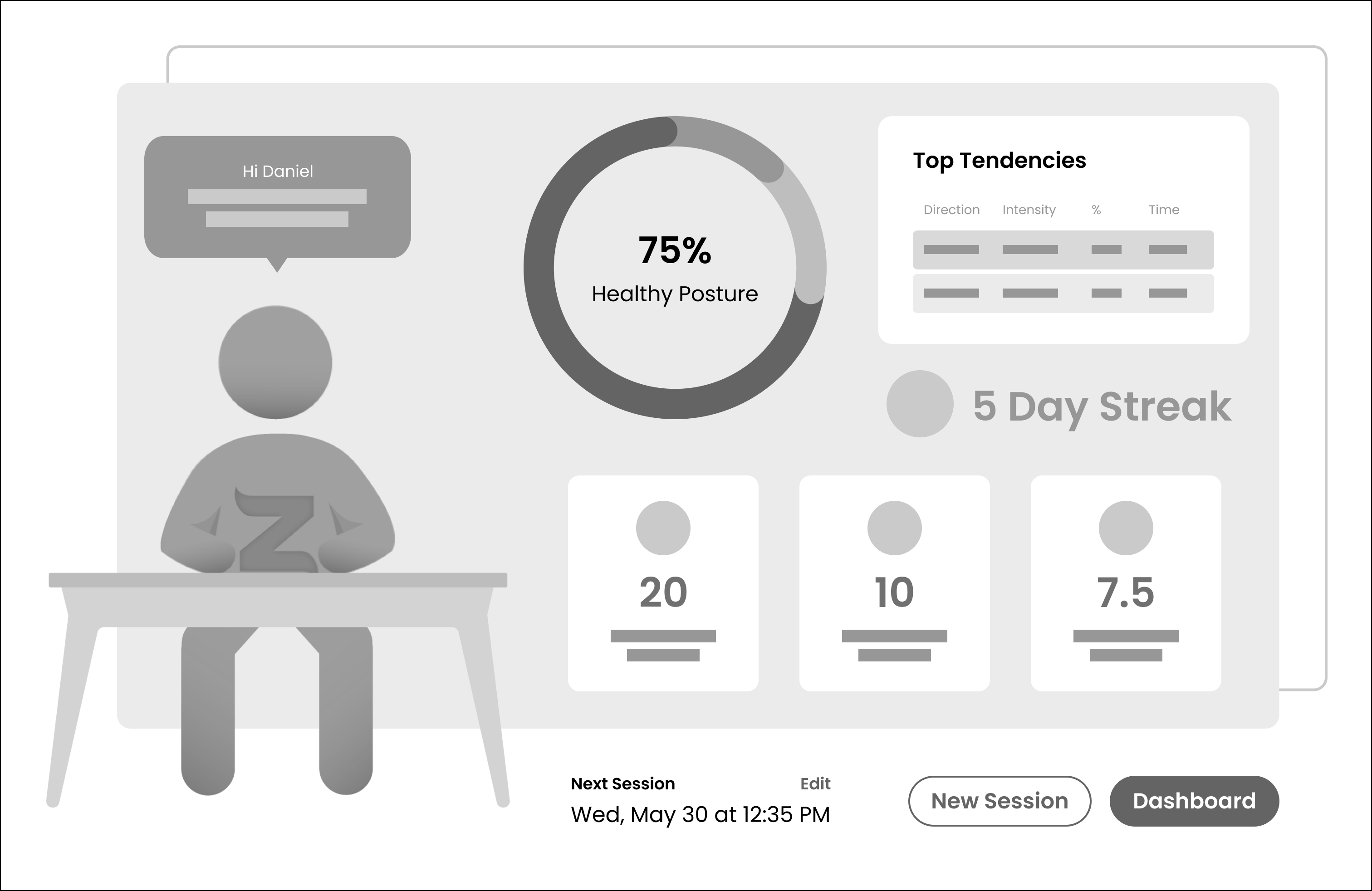
Second iteration of the Certificate (low-fidelity wireframes)
In the second iteration, I created distinct sections and presented them from overall statistics to specific statistics, reflecting that of our competitors.
Second iteration of the Certificate screen (high-fidelity design)
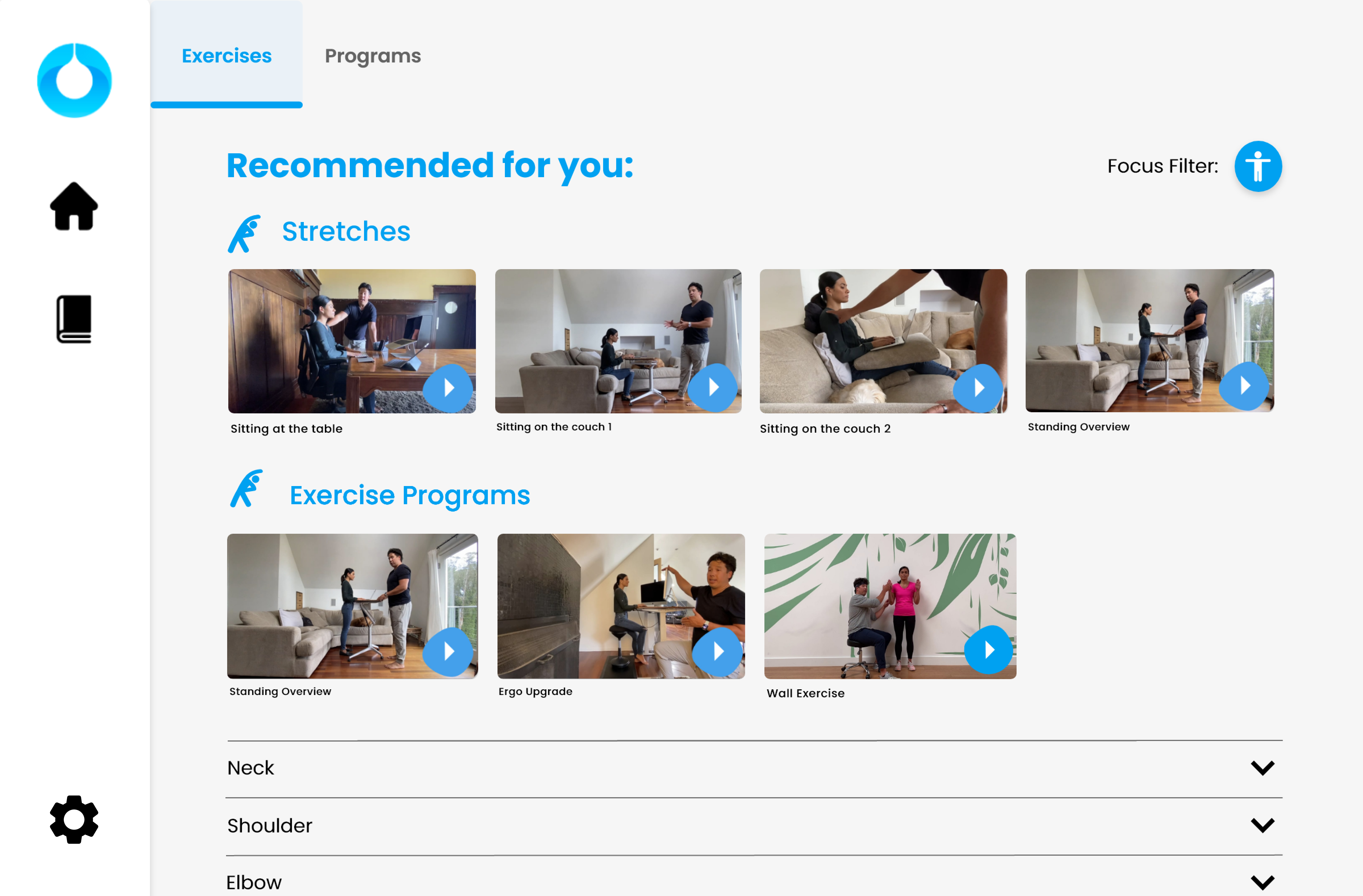
To provide our users with more resources on posture and ergonomics, Zen includes an Education Center.
In the original Education Center, Zen had limited content, so all their available videos were presented on one screen. However, this solution was not very scalable.
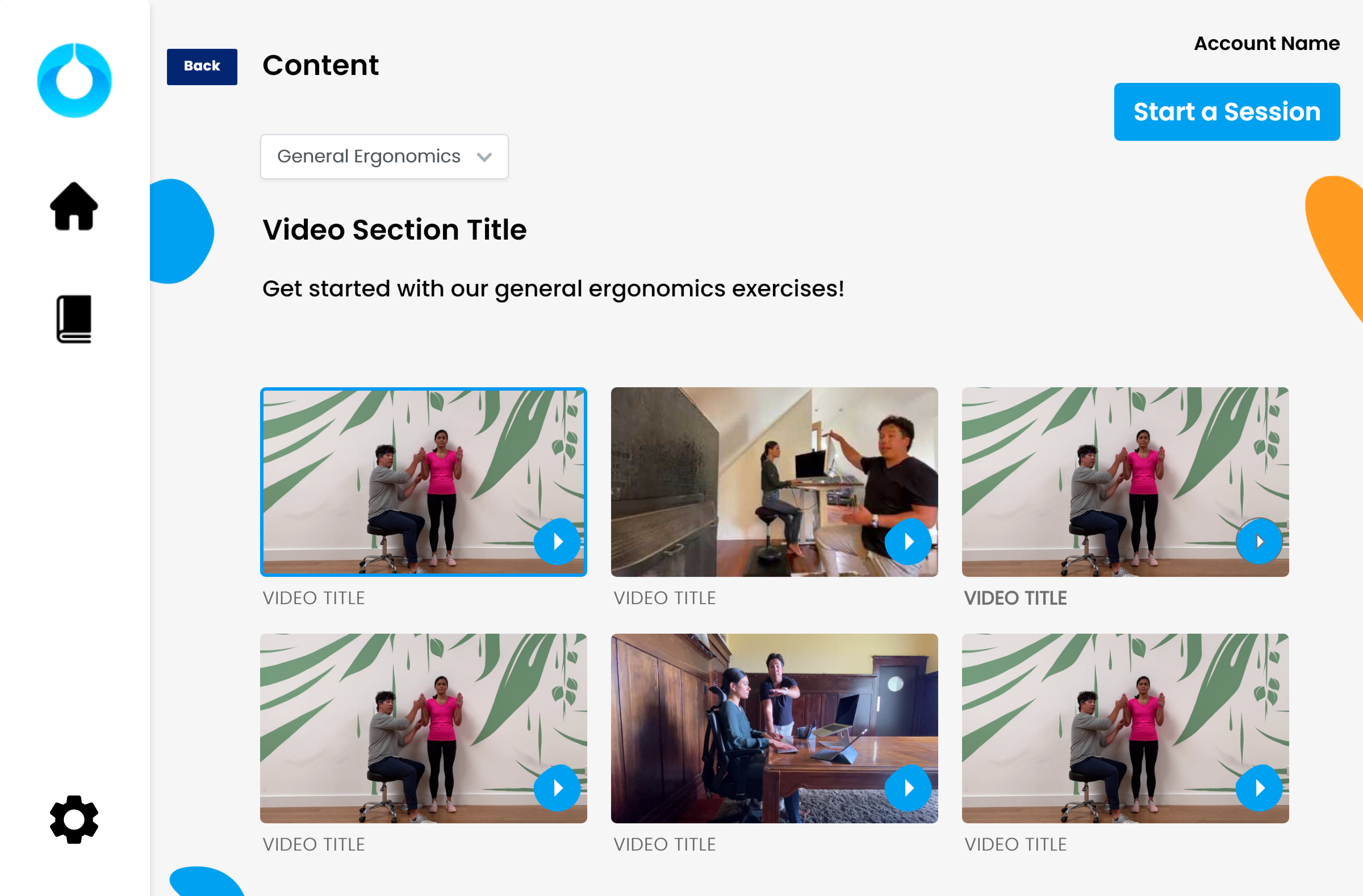
Original design of the Education Center
First iteration of Education Center
Thus, with Zen aiming to expand their current library, I sorted the videos into playlists and placed them in accordion tabs.
The order of the accordion tabs would change depending on the user's filter options. However, this layout was difficult for users to scan through and find videos quickly.
As a result of the feedback from the team, I updated the layout to first highlight recommended videos and then highlight recommended playlists beneath that.

First iteration of Education Center
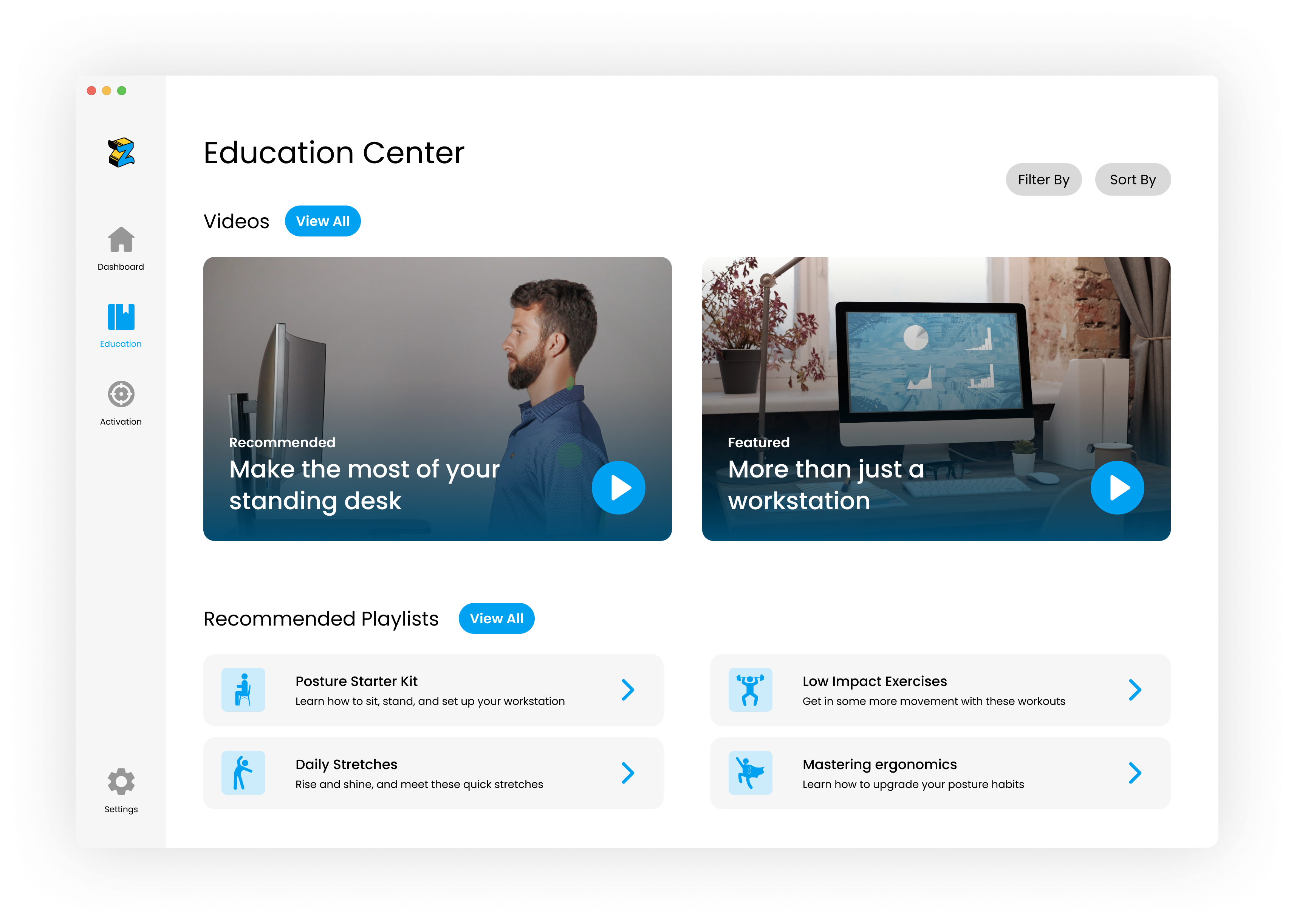
Second iteration of Education Center
The activation center was initially a new feature added to the education center. In collaboration with one of our partners, Daniel proposed to include their physical therapy videos and playlists to the education center.
By providing another resource, we could provide users with more value and potentially increase user retention.
Initially, I added the activation center as a secondary tab within the Education Center.
However, after development, we realized that the activation tab contained too much content and would fit our technical constraints better by moving it to its own screen.
First iteration of Activation Center
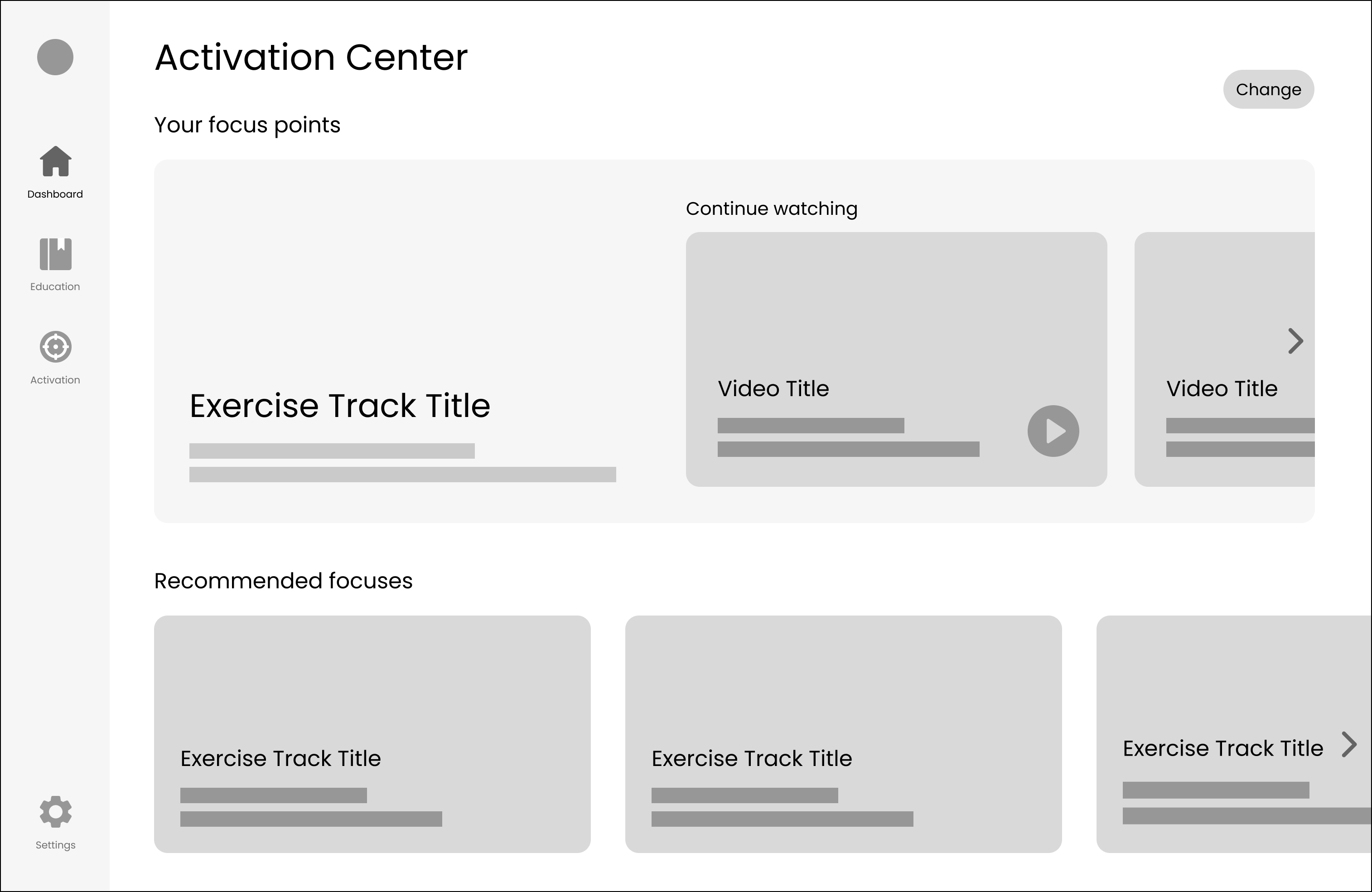
Wireframes for the second iteration of the Activation Center
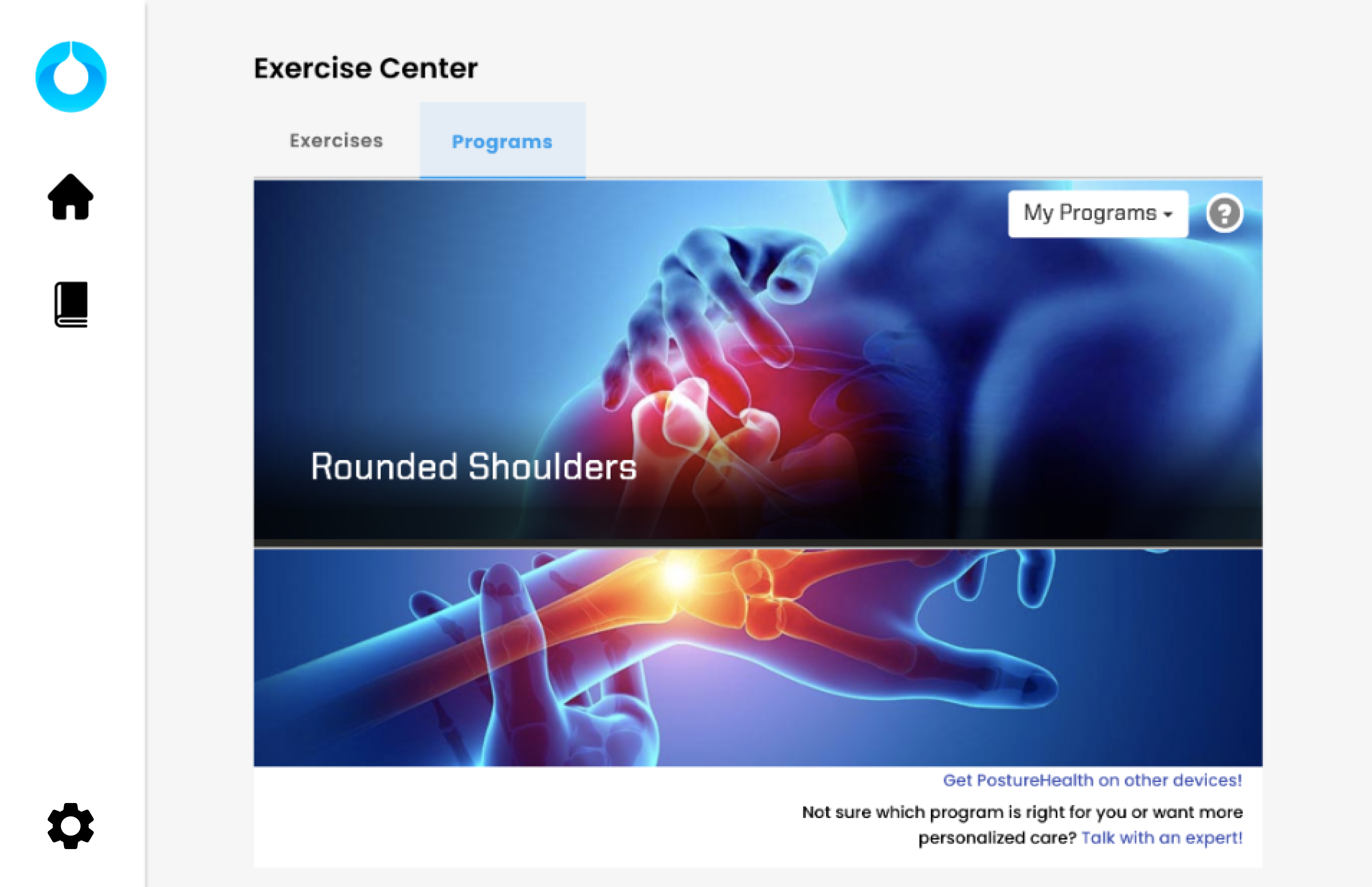
Since the content in the activation center was provided by an external partner, the content contained entirely different branding. I updated the design of the content to better fit Zen's branding, with permission from our partner. However, due to technical and timeline constraints, we were not able to implement Zen's branding and design into this screen.
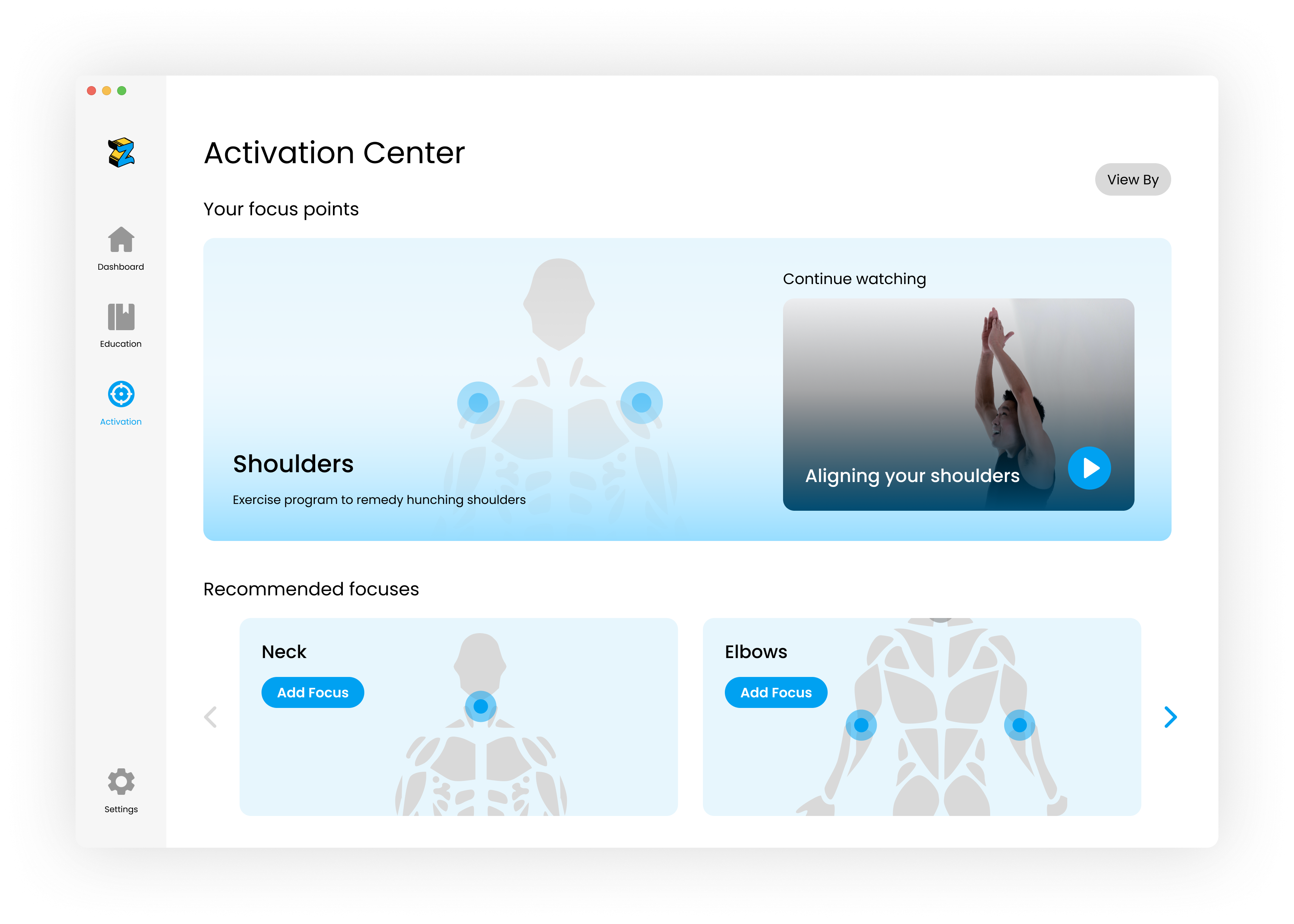
Second iteration of Activation Center
We released this iteration of Zen to a pool of users from a company that offered to present Zen as a company benefit to their employees. From the company size, we expected the number of employees to sign up for Zen to be around the same as the number of users that our data was taken from.
After 3 weeks of observing, we discovered that over 80% of those employees returned to Zen at least 3 times a week after signing up. This was a 77% increase in user retention. This success metric proved that users were able to more clearly see the value that Zen brought to their remote working experience.
As the sole designer on the team, I learned a lot about analyzing qualitative data and making design decisions based on my findings. I found myself using the app frequently to really understand what our users were experiencing and learning to create solutions from not only a design perspective, but also as a user.